
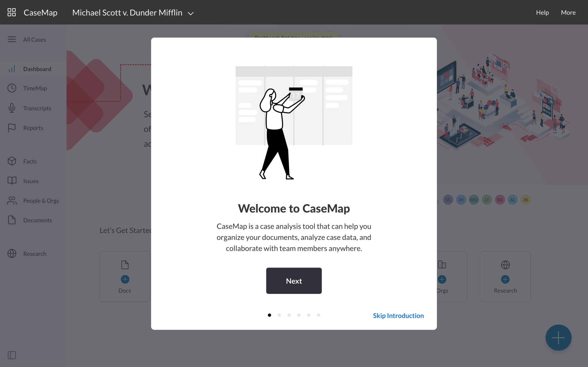
Simplifying legal case management

About this project:
This case study describes the process by which I helped LexisNexis redesign and successfully re-launch its flagship legal case management software.
Organization: LexisNexis
Product: CaseMap Cloud
My Role: UX Designer
Location: Raleigh, NC
Duration: October 2019 — October 2020 (1 year)
Tags: Wireframing, Prototyping, Low-fidelity Design, High-fidelity Design, Ideation & Sketching, SME Interviews, User Interviews, User Testing, Design System, Adobe XD, Sketch, Mural, Zeplin, Tetra Insights


Jump ahead and see the final product ↑
The Challenges ⛈
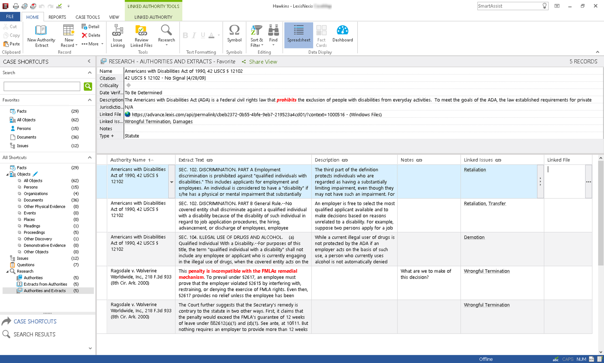
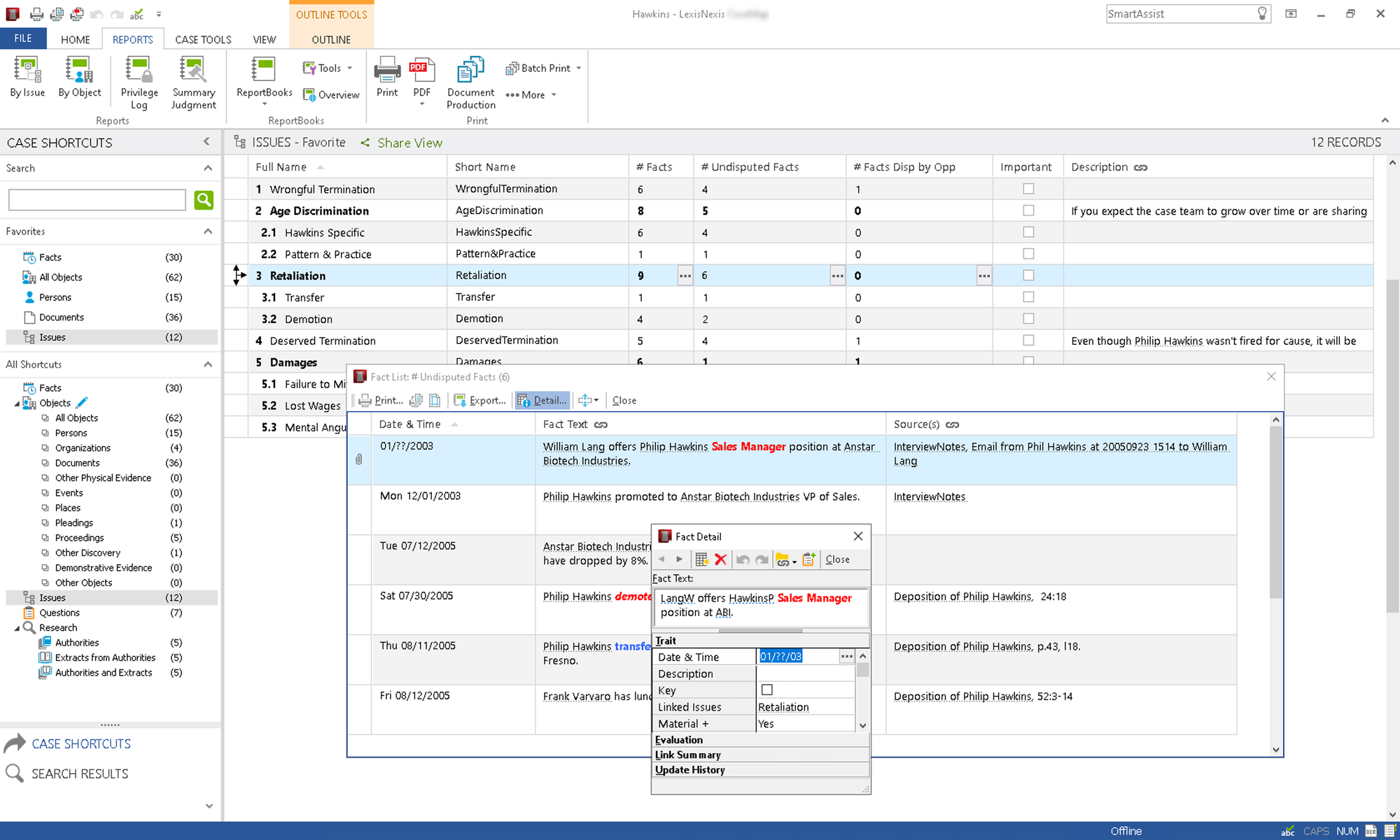
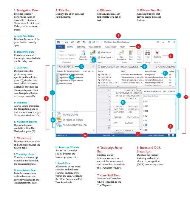
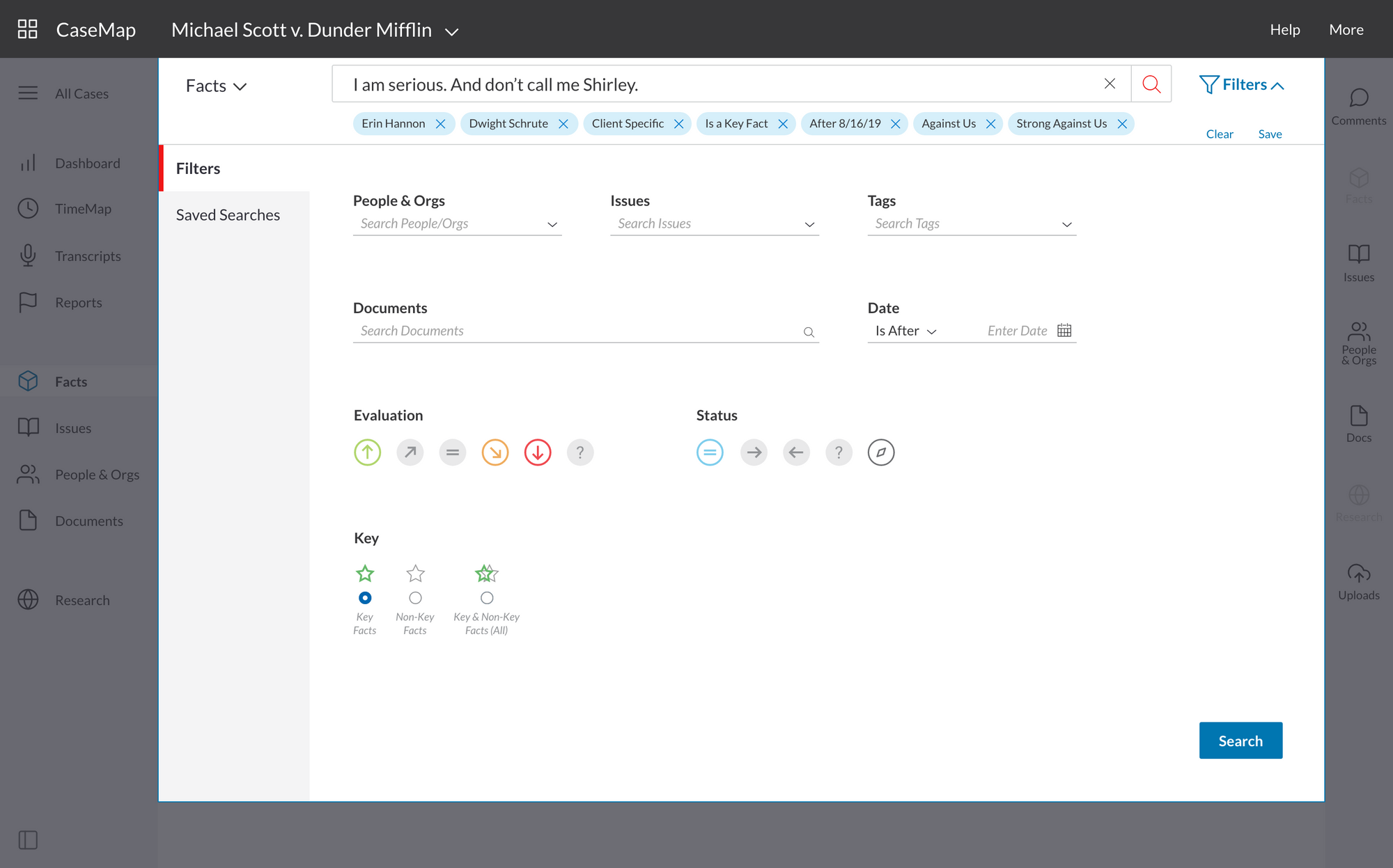
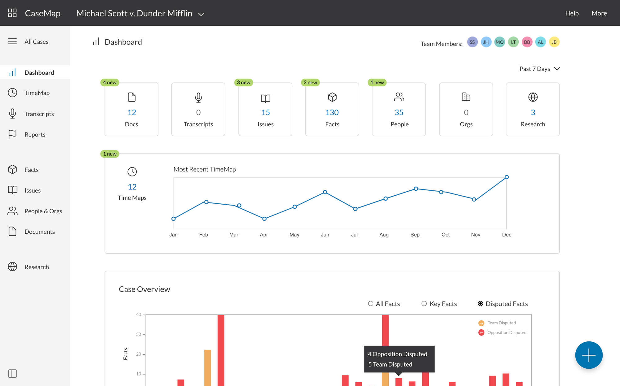
CaseMap is a LexisNexis (LN) product that allows legal professionals (attorneys, paralegals, etc.) to manage their open cases. Before this project, CaseMap existed only as an installed Windows desktop application for 20+ years.
The original product
Beyond providing a cloud-based solution to our customers, our team set out to solve these problems with the legacy product:
- Steep learning curve
- CaseMap users often had to go through a 6-week training course just to learn how to use the software
- Poor navigability & lack of visual hierarchy (outdated design)
- As you can see in the screenshots below, the legacy product used a Microsoft UI and combined the top ribbon menu with a vertical navigation menu on the left. This combination was confusing according to most users.
- Lack of consistency with other LexisNexis products
- At the time of this project (2019-2020), LexisNexis was unveiling a redesign of a major product, Nexis, as well as launching a new flagship product Lexis+. The company was also testing a new subscription model wherein users could gain access to more products. Consequently, the goal was to present a unified, cohesive suite of beautiful, user-friendly products that shared the same design language.
The Goals 🎯
Our team had many aims for the redesign but our foremost objective was to address the following:
- Flatten the learning curve
- It shouldn't take six weeks to learn how to use a piece of software! In fact, users should be able to understand and use it almost immediately.
- Reduce the time required to complete common tasks (implement modern design patterns)
- In line with the first goal, users should be able to complete tasks with greater speed and efficiency than before.
- Ensure cohesion within the larger suite of LexisNexis cloud products
- As mentioned above, the company wanted to present subscription packages to customers, not disparate products. As such, our goal was to implement a shared visual language and a single design system.
The Process 🛫
Although the project did not always follow a linear path, the sequence below roughly reflects the overall progression from problem to solution. Each stage will be explored further in this case study.

① Discovery 🔭
Before jumping into brainstorming potential solutions, our team needed to understand the current product, its strengths and weaknesses, and the constraints that limited the new product technically. We used the following methods to gather this information:
- Interviews with users and Subject Matter Experts (SMEs)
- these groups often overlapped
- we spoke with our Product Lead extensively-- he was called the "Product Historian" because he had been involved with the development of CaseMap since its initial inception (over 20 years)
- Competitor analysis of comparable products on the market
- Heuristic evaluation of the legacy product
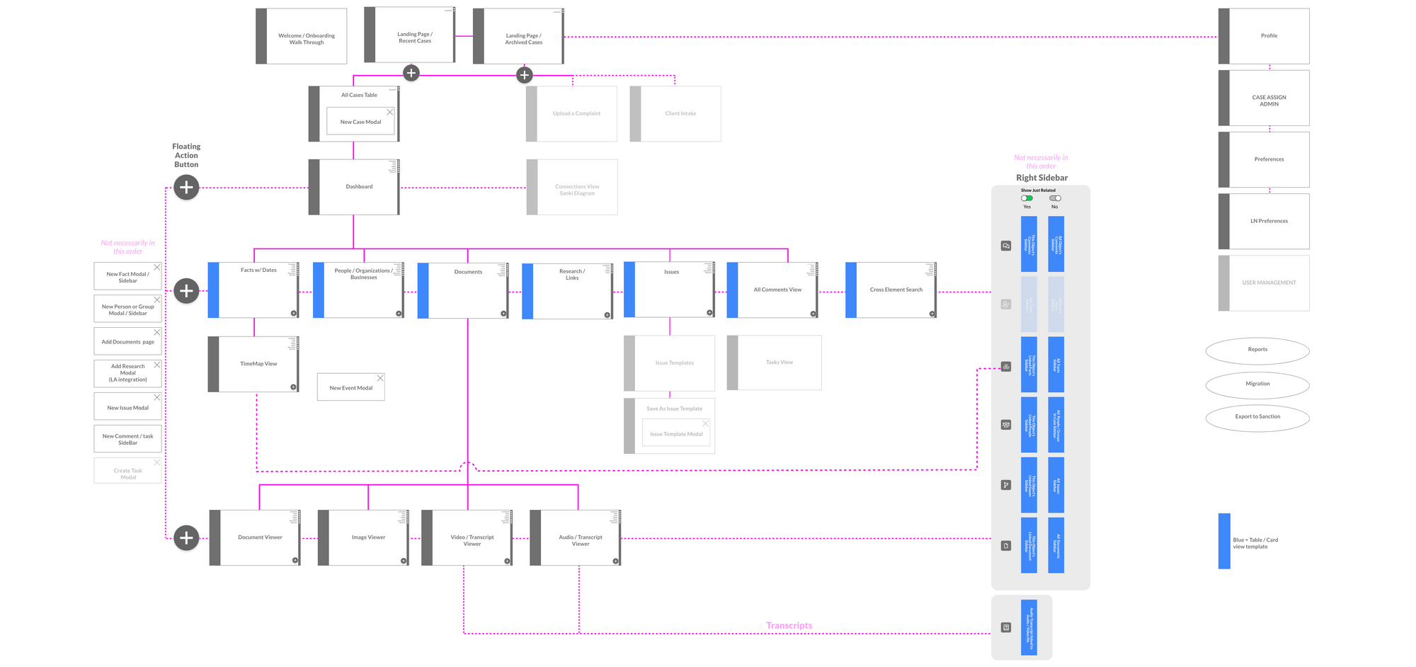
- Information architecture
- Our team mapped the IA of the legacy product as well as started to define the user flows of our updated version. One such flow is shown below:
② Concept Development 💡
Whether it be brainstorming new UI patterns or diagramming relationships between data, it all started on the whiteboard! This was personally my favorite part of the project because it brought together the team and encouraged us to be creatively divergent. Once our ideas were on the board, we narrowed them down and made the concepts real through simple grayscale wireframes.
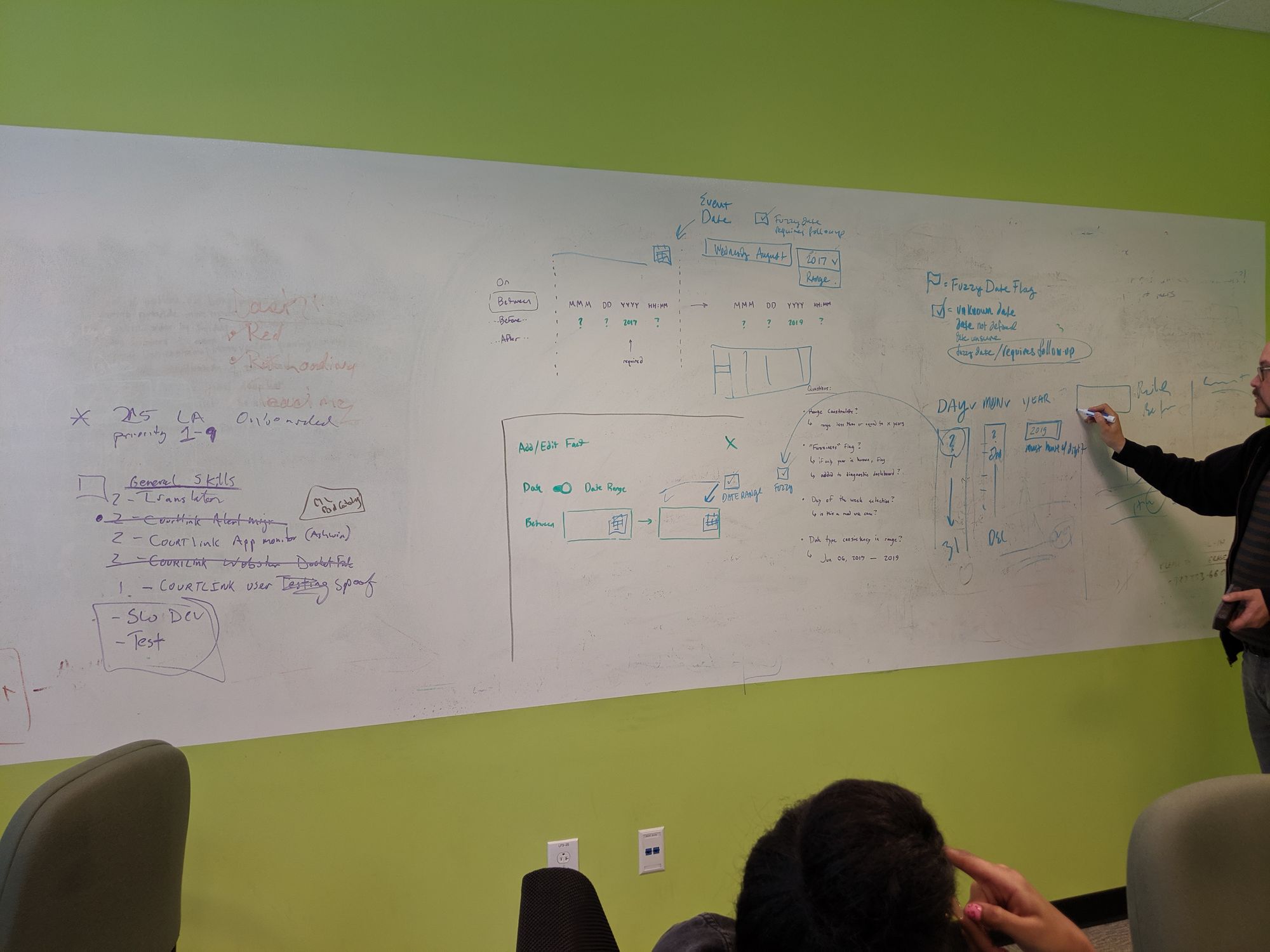
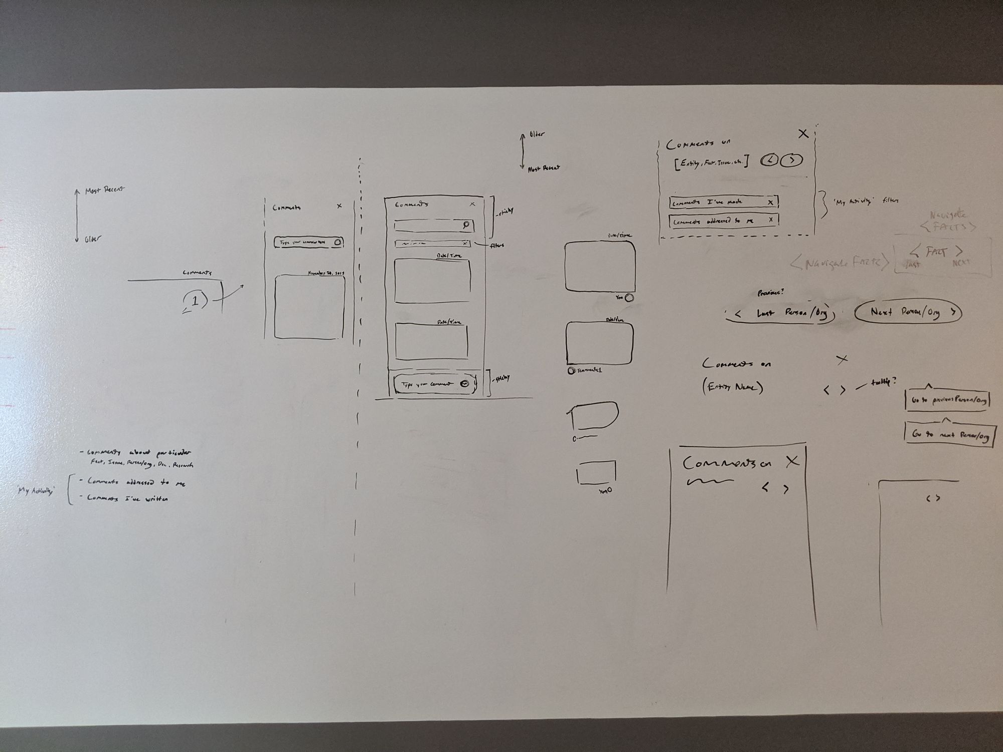
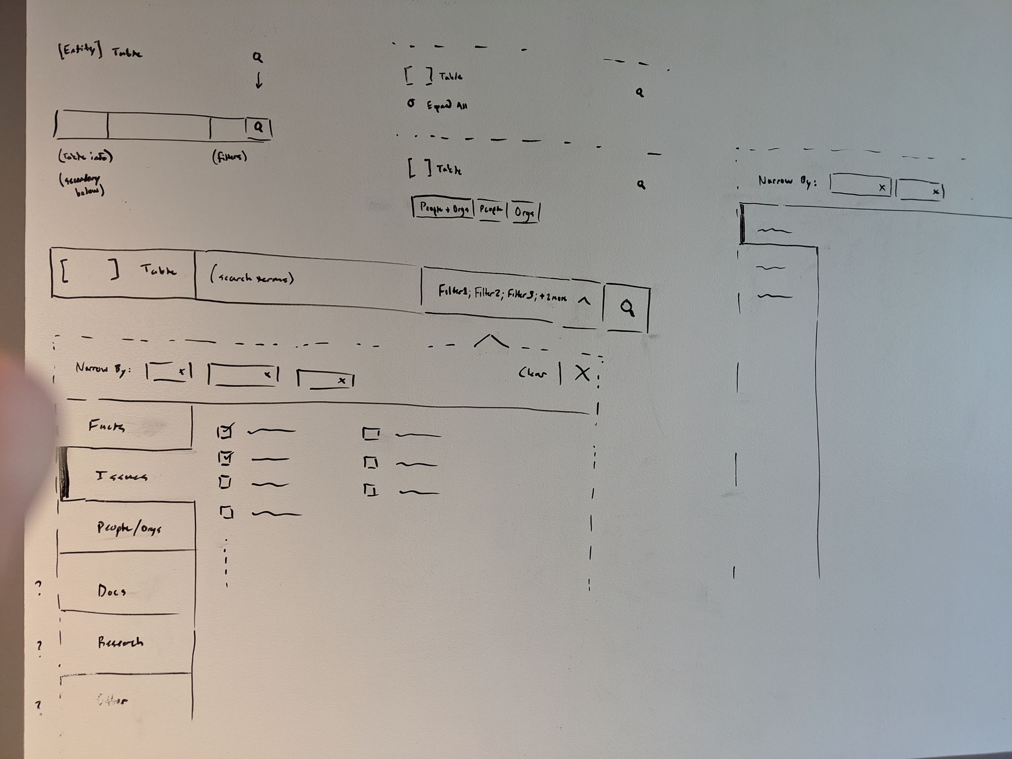
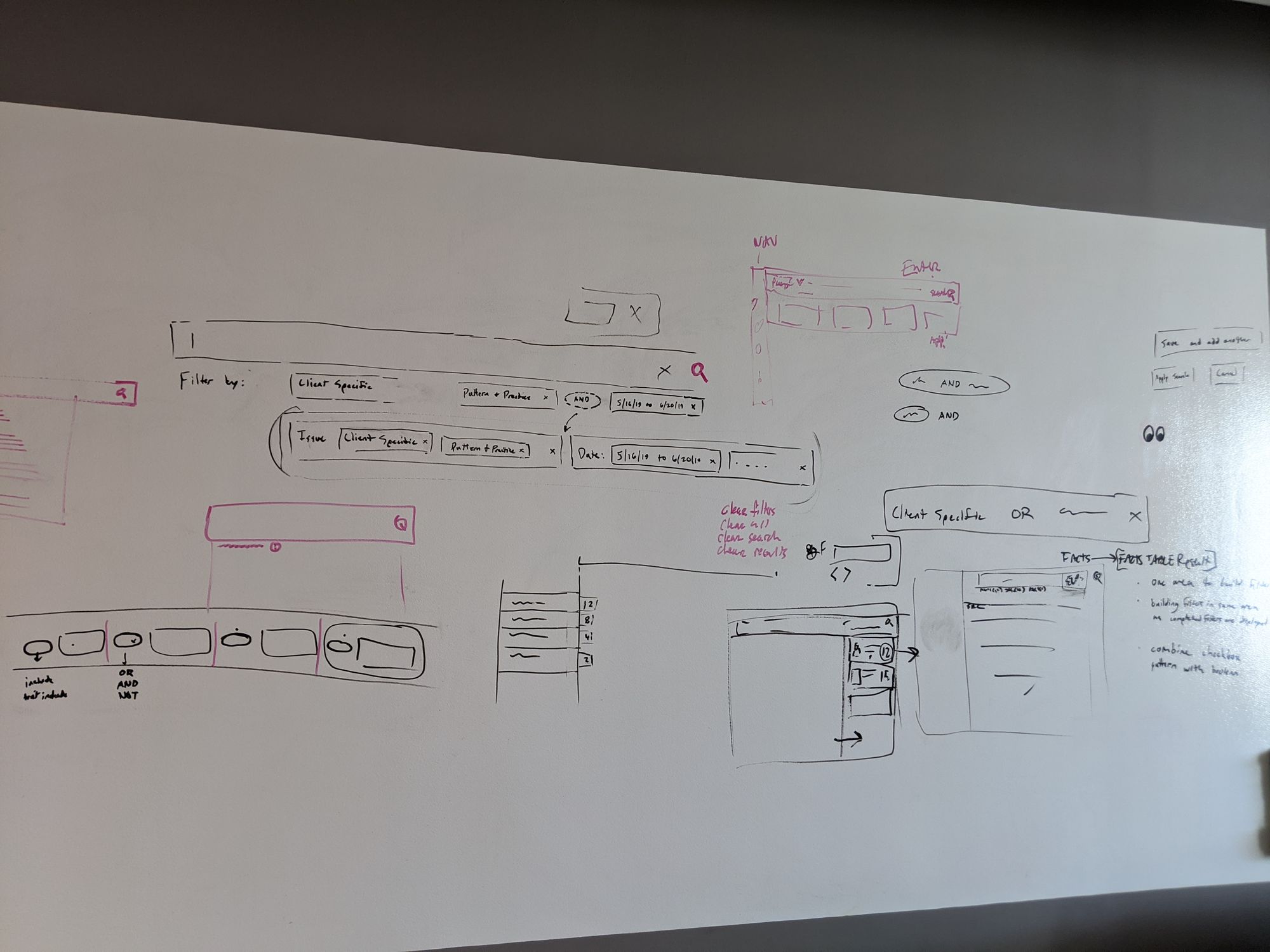
Whiteboarding sessions
Early wireframes
③ Concept Testing 💬
The purpose of concept testing was to gauge the user reaction to new design patterns and validate or invalidate our decisions and assumptions. Because we interacted with users early and often, we were able to quickly verify which ideas to keep and which to scrap. The following are three early studies conducted by the team.
Study #1: User Response to Foundational Design Concepts
Study #2: User Response to Case-building Tools
Study #3: User Response to Data Tables & Navigation
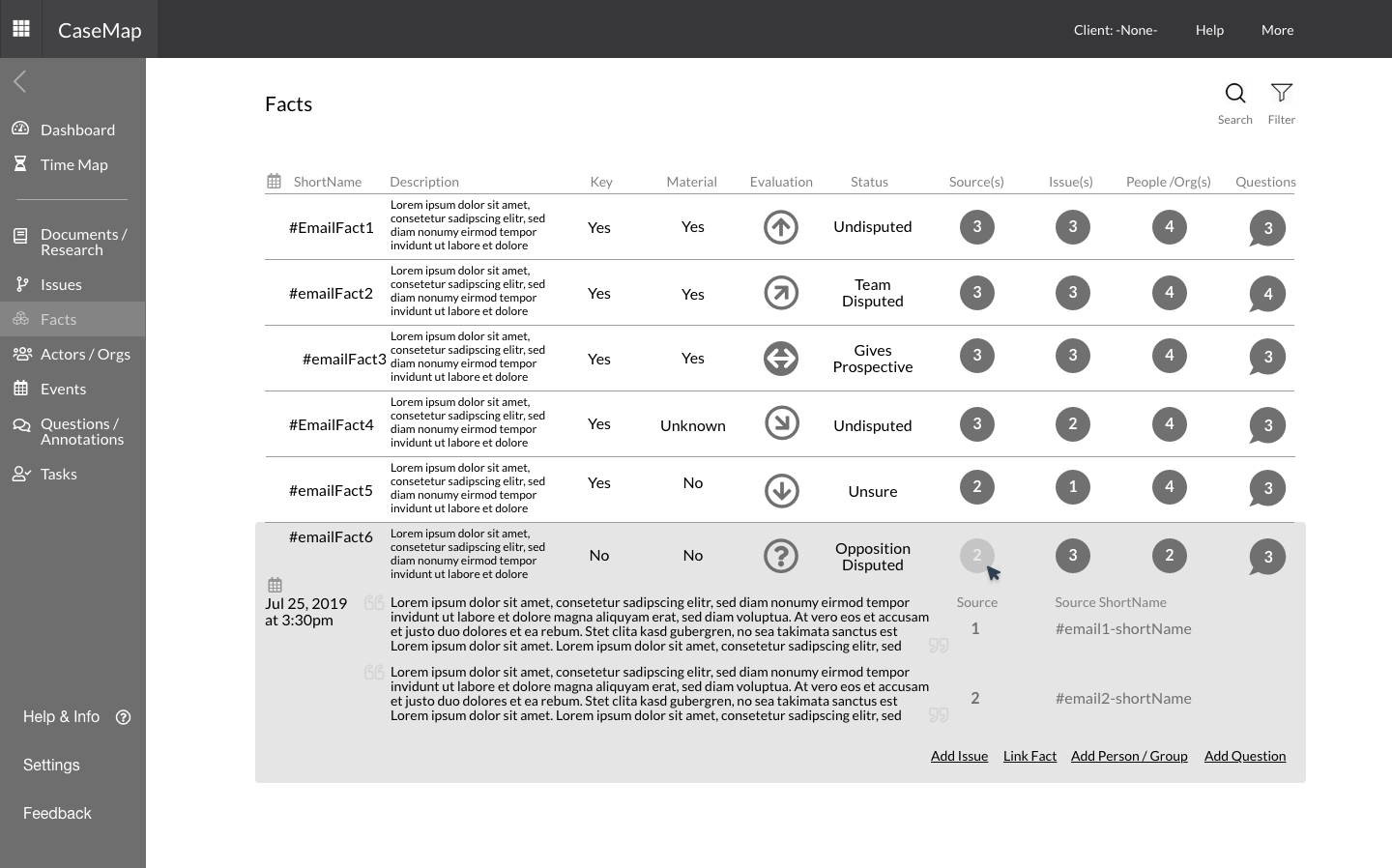
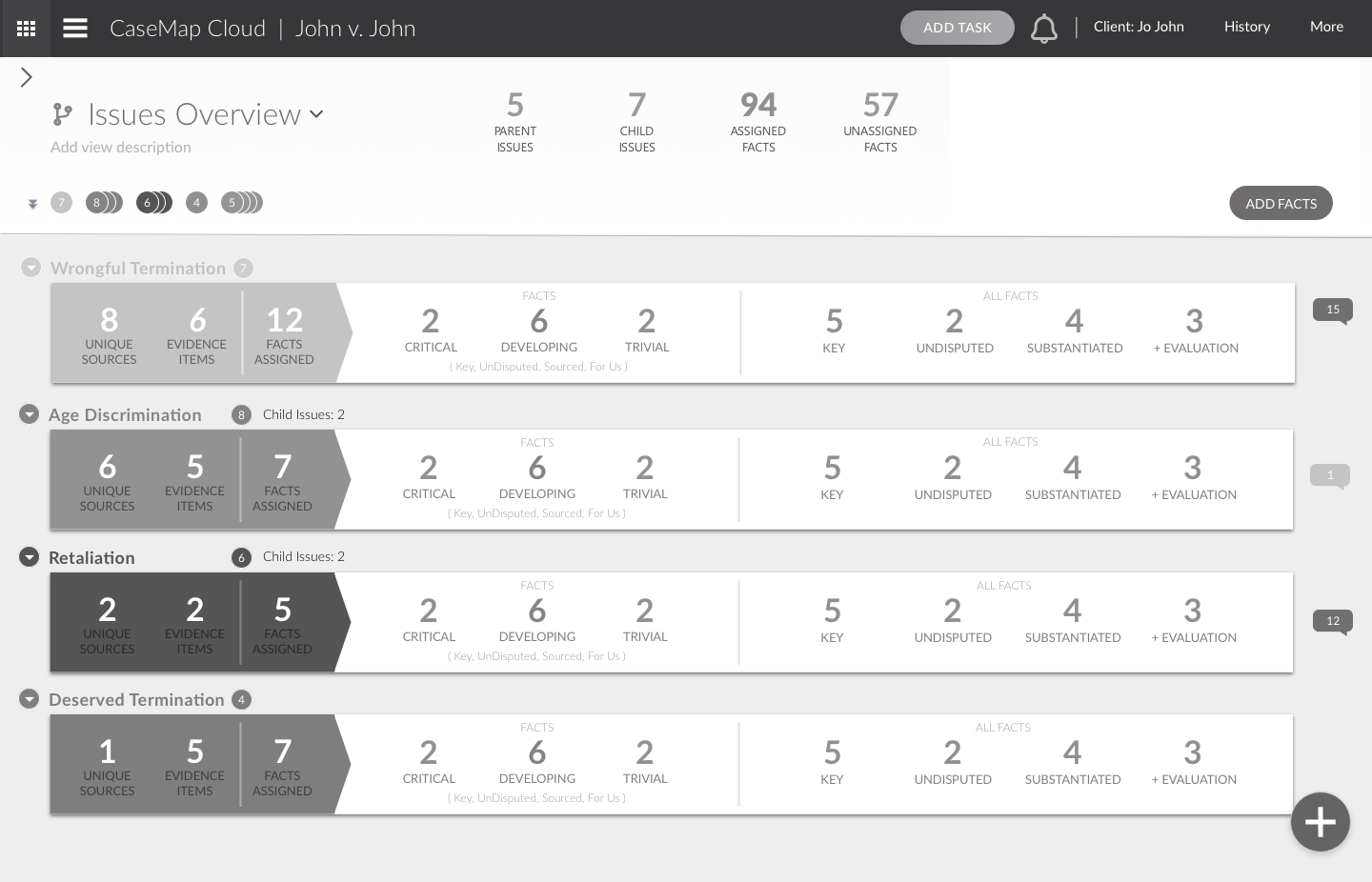
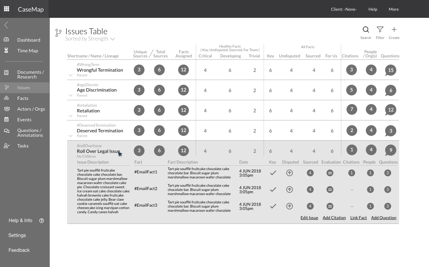
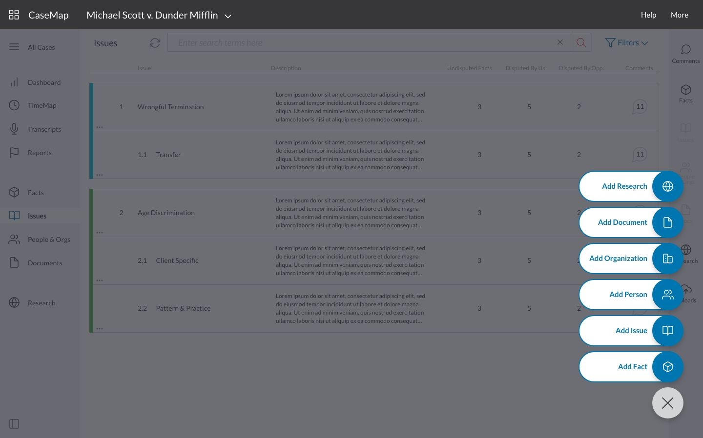
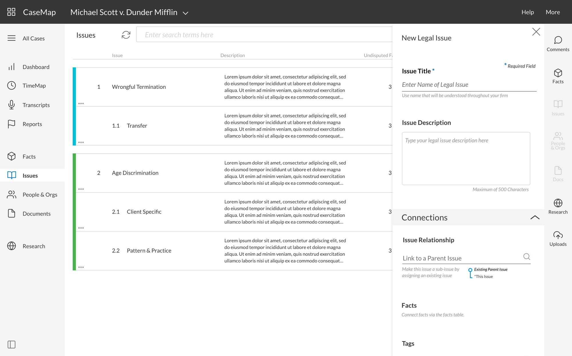
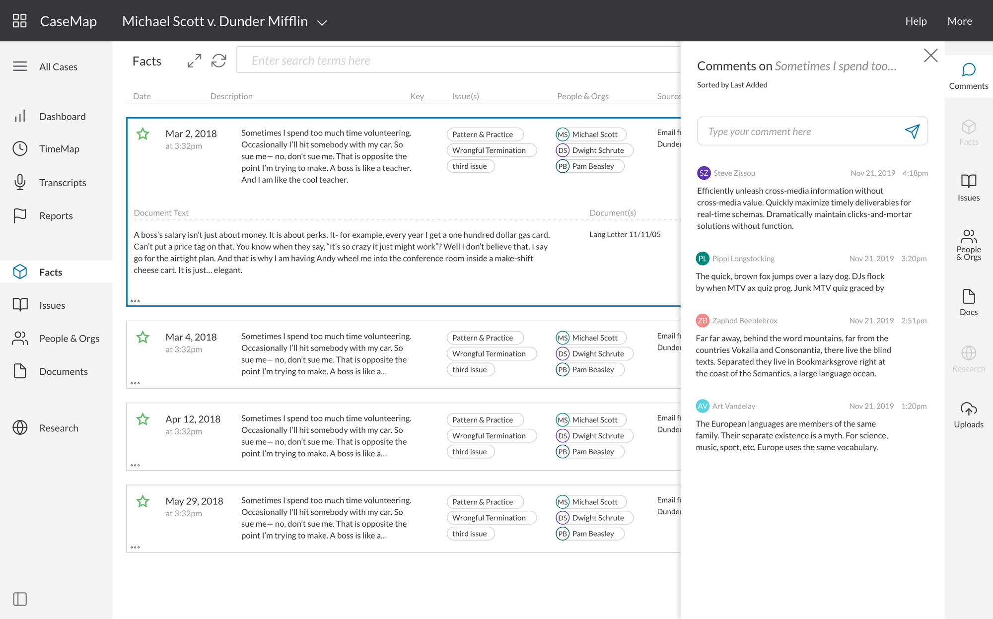
④ Prototype Development 🖥
Developing and refining the clickable prototype was by far the most time-intensive and demanding task required of the design team. Because of the sheer scope of the project (more than 200 screens), it was necessary to build a robust library of design components. For each UI component, different states and interactions were defined so that repetitive work could be kept at a minimum.
The Component Library
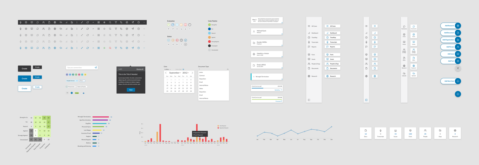
The Canvas
⑤ Usability Testing 💁♀️
After our team built a working clickable prototype, we tested it with 14 users over the course of several weeks on weekly "User Fridays."
About This Research
Participants: 14 legal professionals
- 4 users had greater than 5 years of CaseMap experience
- 7 had less than 5 years
- 3 were non-users
We recorded, transcribed, and coded the data using Tetra Insights. We focused on three types of data:
- General feedback about their experience using the new product
- UI-specific feedback — the user’s experience with newly designed components and interactions that were not familiar to the legacy product
- User actions — nonverbal usage observations
Findings & Results:
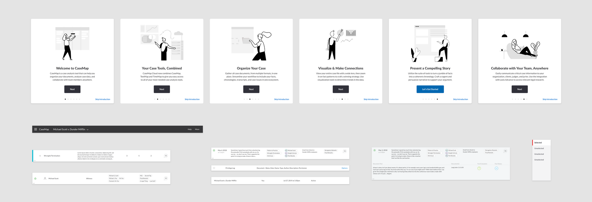
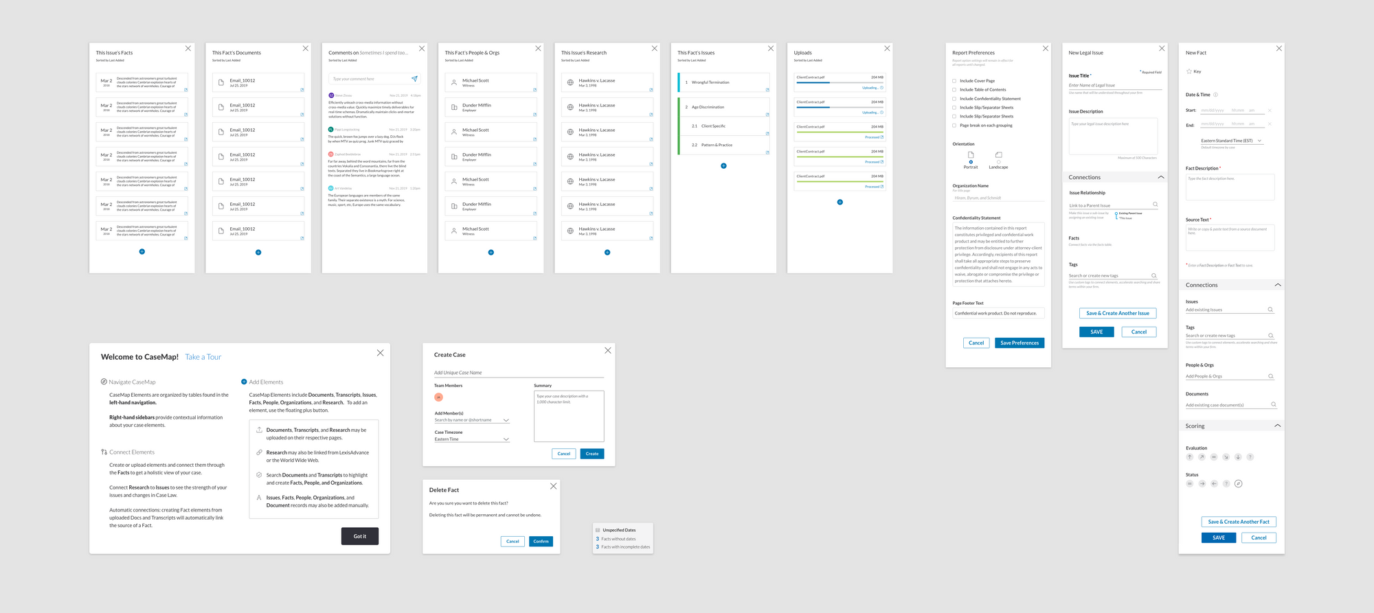
⑥ Refinement & Handoff 📐
This stage didn't occur at any particular time, but rather throughout the project. As the design and research team finished iterating on an area of the product, we would publish the live prototype with Adobe Xd's "Design Specs" mode, which allowed our developer counterparts to easily inspect all details and assets.
Screens from the high-fidelity prototype
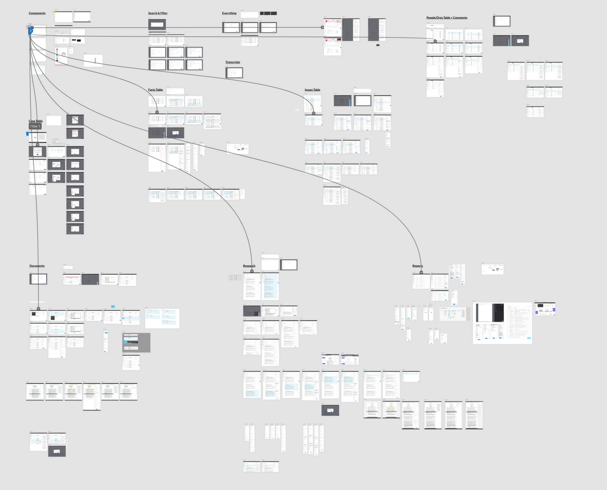
The Clickable Prototype

View the interactive version of the screens above
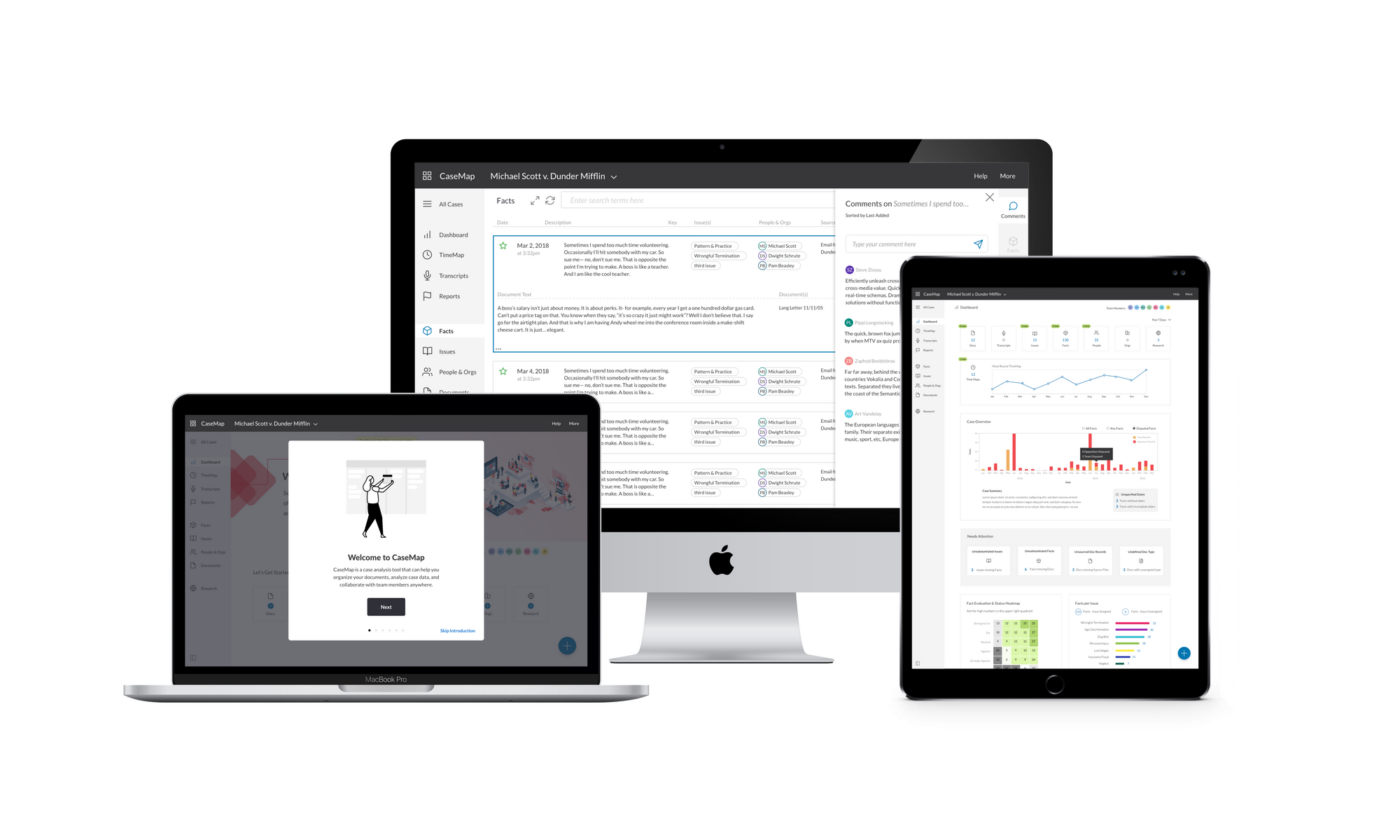
Results 📈
CaseMap Cloud was launched in late 2021 and was a resounding success! It was received very well by both existing LexisNexis customers and subscribers to the new cloud-based suite of products. Along with the simplified interface, the ability for legal professionals to collaborate with team members anywhere was especially useful as many people continued working remotely in the wake of the pandemic.

You can also see the full marketing site for the product here
Reflection & Learnings💡
What we did well:
- Great communication and collaboration among the entire team
- UX, Visual Design, Product, and Engineering team members stayed in close contact and always responded quickly
What we could've done better:
- We relied too heavily on superusers and one SME
- Didn’t include many non-users in testing
- We didn't wireframe in low fidelity
- We used Adobe XD to create wireframes that were too detailed and took too much time to modify
- Led to time-consuming double-work that could have been avoided
- We should have tested some assumptions from the start
- Some problems that emerged from concept testing were not addressed
- The iPad & mobile use cases should have been considered from the beginning
- We could have been more thorough with the design specifications handed off to the engineering team
- Didn't include detailed notes and often had to reactively respond to development miscommunications