ClinicalTrials.gov
Designing a clearer path into clinical trials
Org: Independent project
Role: UX designer
Location: Raleigh, NC
Duration: 2 months (2019)
Clinical trials are critical for bringing new treatments to patients, but most trials struggle to recruit enough participants. Many people either don’t know clinical trials exist or can’t tell whether a study is relevant to them.
This project explored how to make that journey clearer for patients. I studied how people currently find trials on ClinicalTrials.gov, talked with principal investigators and participants, and then designed an experience focused on:
explaining studies in plain language
surfacing only the information patients need to decide
making “how to join” an obvious, guided endpoint
The outcome was an end-to-end flow and clickable prototype, plus a front-end MVP built with a developer, that turned a dense database search into a simple, step-by-step way to find and contact a trial.
The number one challenge to everyone in the industry is patient recruitment. As technologists, one way we can immediately combat this problem is by making it easier for patients to join a clinical trial.
— Willie Muehlhausen, Head of Innovation at CRO ICON
What if we could put millions of people in the right clinical study at the right place and time? People who've had long-term diseases or pain. We would save countless lives and reduce untold suffering.
— Jeff Kasher, former VP of Clinical Innovation at Eli Lilly
Problem
Clinical trial recruitment is chronically slow and inefficient. A large majority of trials are delayed because they can’t enroll enough participants, and many sites miss their enrollment targets altogether. At the same time, most people have little to no understanding of clinical trials or how to join one.
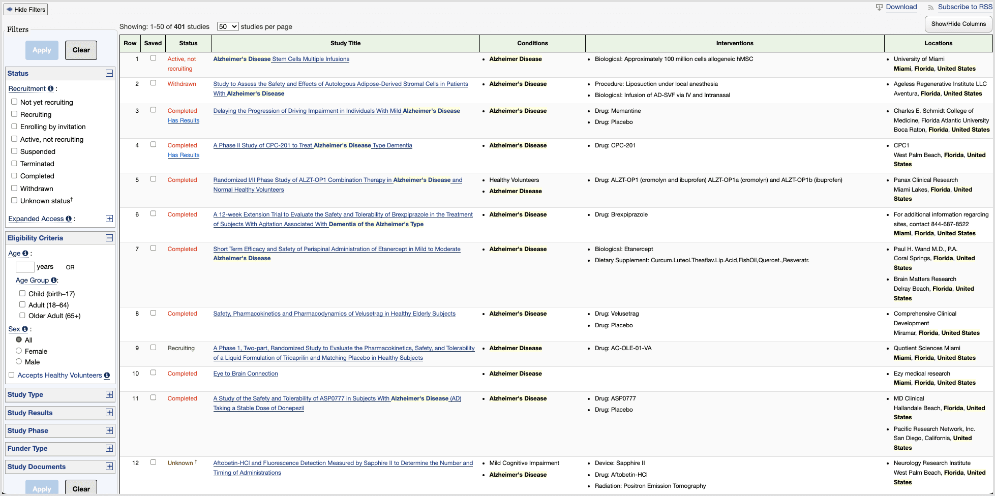
On ClinicalTrials.gov—the main public database of trials in the US—patients run into three core issues:
Dense pages
Search results and study detail pages are overloaded with data. It’s hard to tell what matters, where to start, or what to do next, especially for older or less tech-savvy users.
Inaccessible language
Even people with advanced medical training find the terminology heavy. For a typical patient, it’s difficult to understand eligibility criteria or whether a study is relevant to their condition.
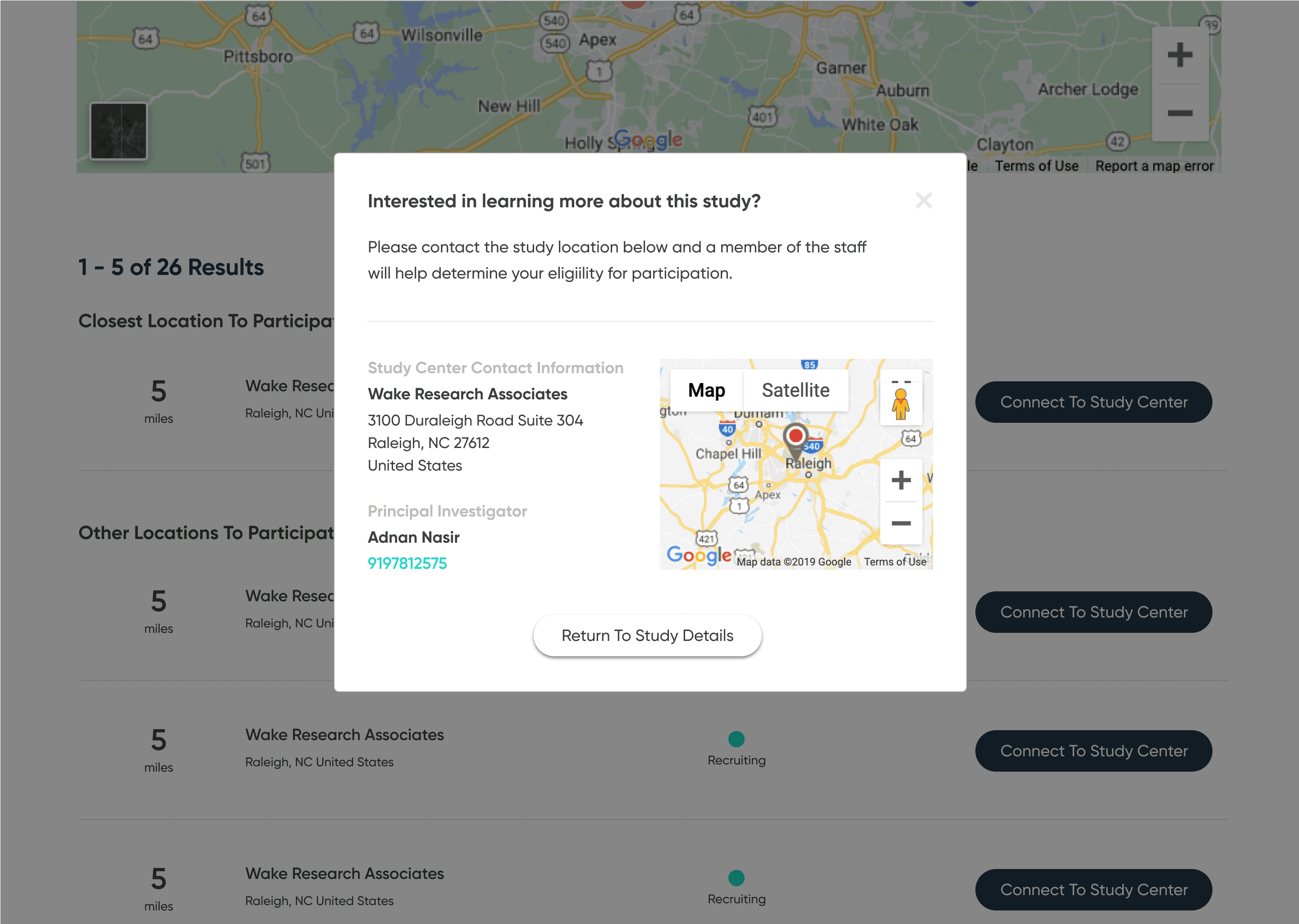
No clear path to enrollment
ClinicalTrials.gov behaves like a raw database: it assumes people know what they’re looking for. Critical patient questions—What’s the purpose? What’s the time commitment? Where is it? How do I contact someone?—are buried, and the contact details are tucked away at the bottom of the page.
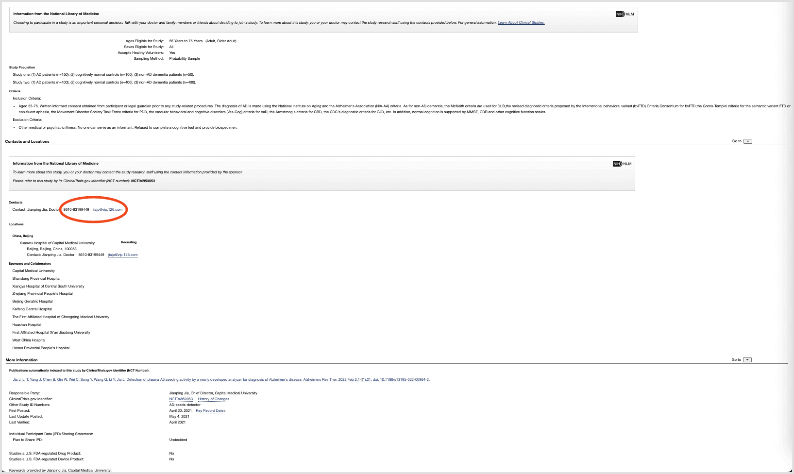
The result: people who might be willing to participate never make it all the way to enrolling.
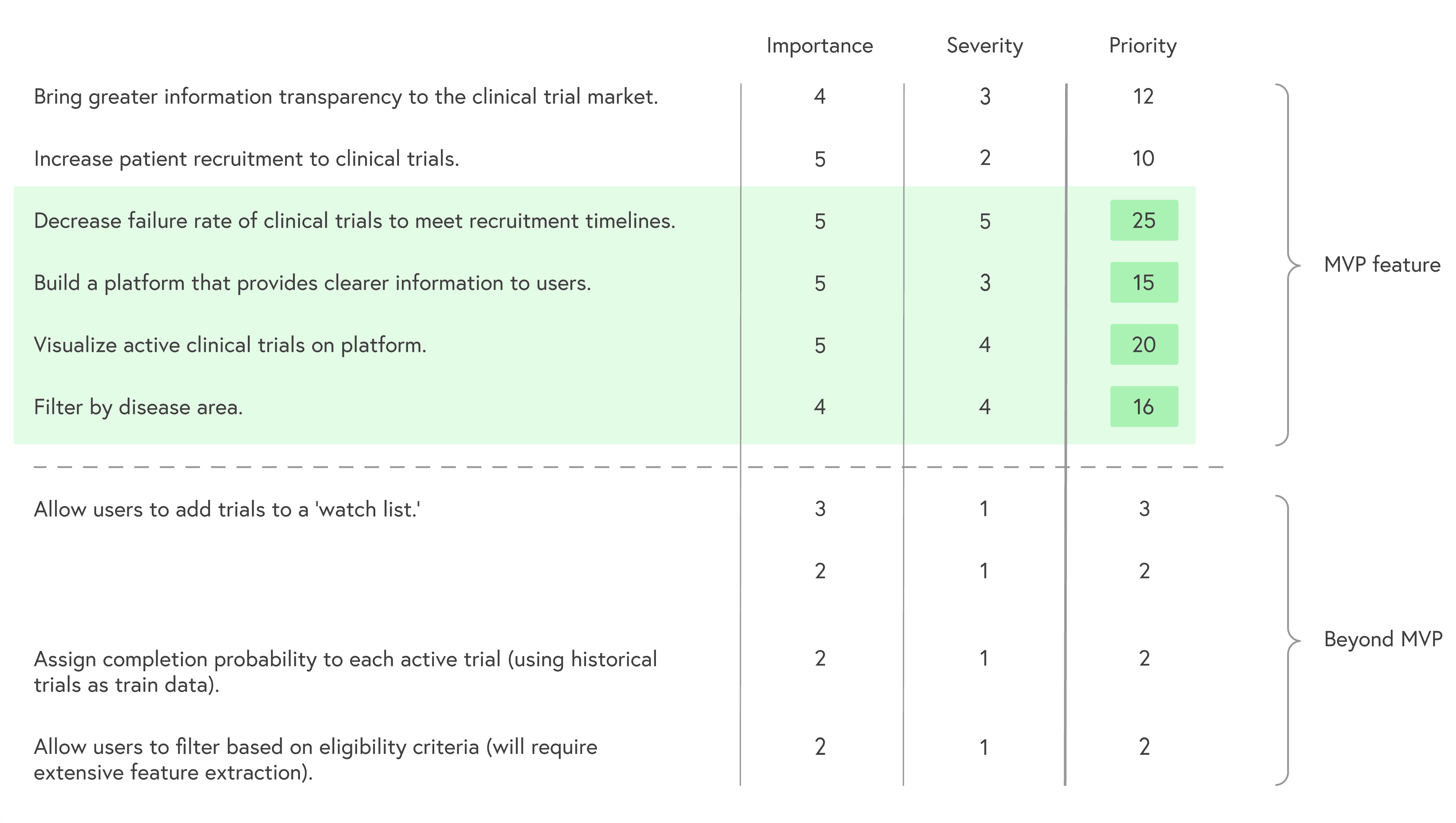
Goals and constraints
With roughly two months to work, I defined a focused MVP:
Make the path to joining a trial explicit and guided
Prioritize the information patients actually use to decide
Translate study content into clearer, more approachable language
Avoid changing the underlying data model of ClinicalTrials.gov
I prioritized goals by combining importance and severity of each problem to keep scope realistic while still impactful.
Research
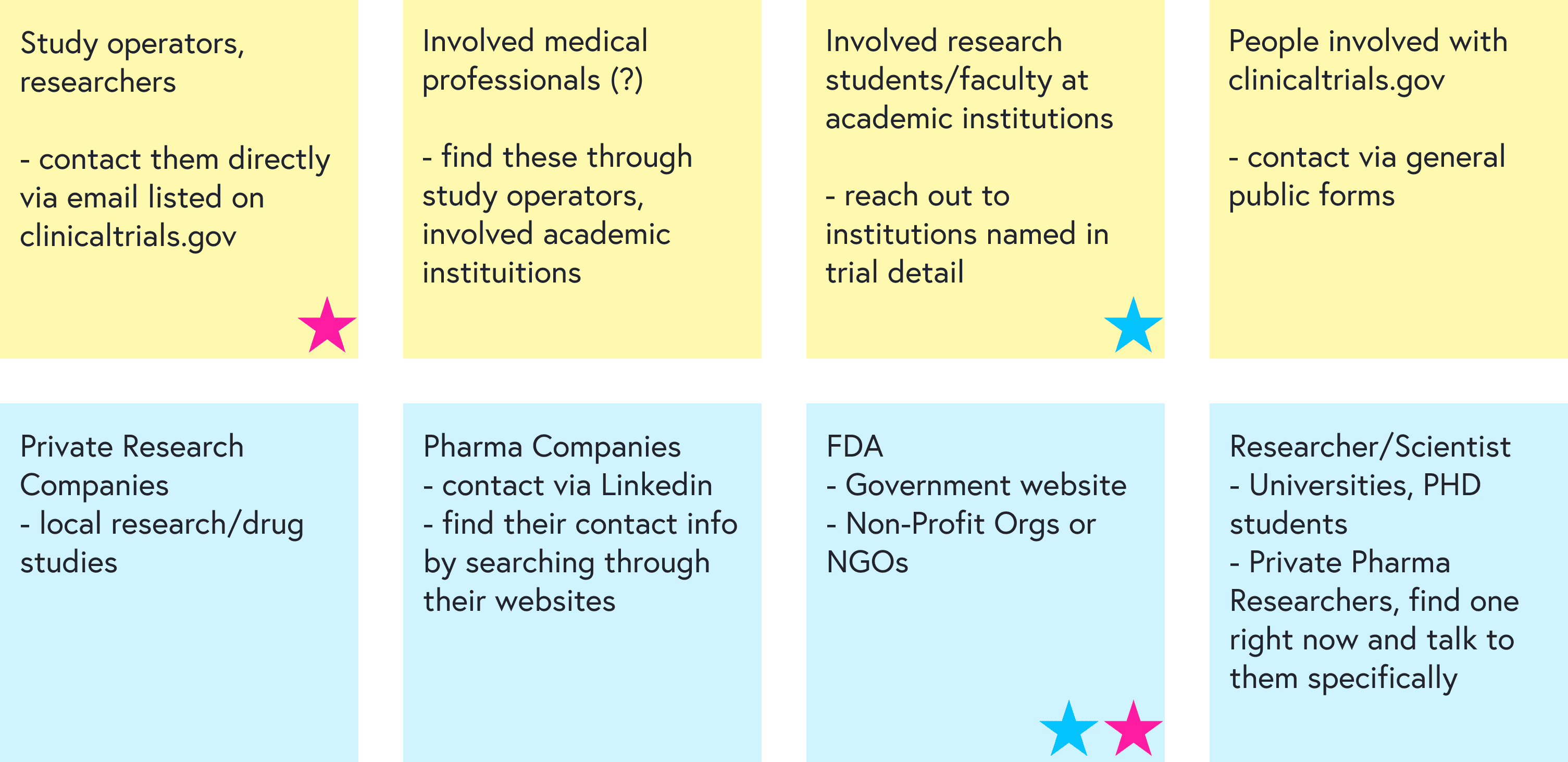
Stakeholders and users
I started by mapping the landscape with coworkers and identifying:
Stakeholders: principal investigators, research coordinators, sponsors, patients, healthy volunteers
Primary users for this project: patients actively seeking treatment via trials
Secondary users: healthy volunteers, often recruited locally rather than via ClinicalTrials.gov
We then brainstormed how to reach each group for feedback and prioritized the most feasible paths:
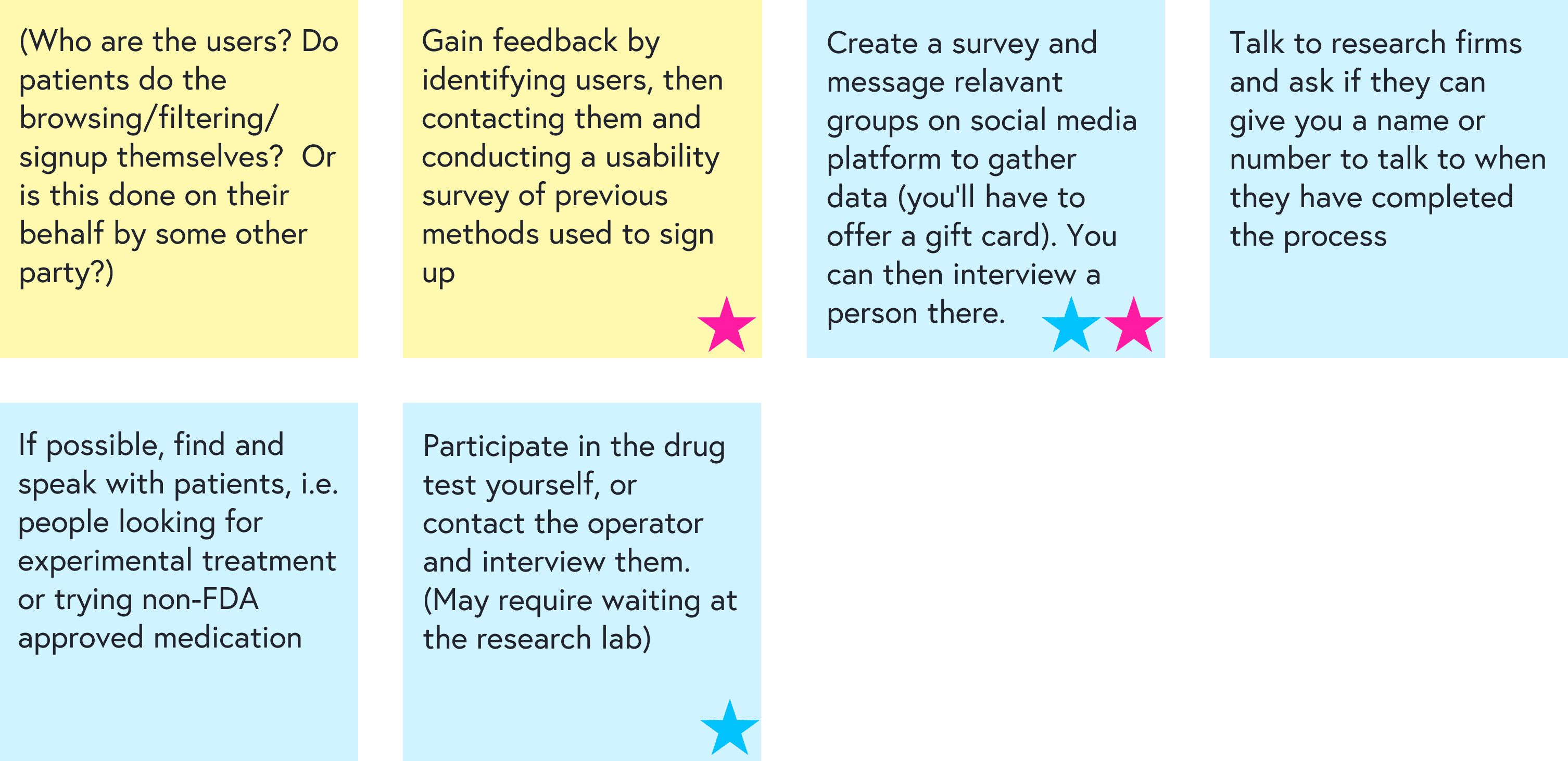
Interviews and contextual inquiry
To understand real-world recruitment, I spoke with:
3 principal investigators running actively recruiting studies at Duke, PRA/Hoffmann-La Roche, and Campbell University
1 participant who’d joined two diet and neurological health studies and now works as a physical therapist with trial participants
1 parent of a child in a Duchenne muscular dystrophy trial
I also went through the full eligibility screening process for one trial myself, acting as a prospective participant. This helped surface which details actually shape a patient’s decision and which steps are confusing or intimidating.
Key insights
Two distinct participant types
patients seeking treatment or access to new therapies
healthy volunteers motivated by altruism, curiosity, or compensation
Different recruitment channels
healthy volunteers are usually recruited locally (flyers, social posts, campus boards)
patients often hear about trials from their physician or are told to search online, typically starting with ClinicalTrials.gov
What patients care about most
When deciding whether to join, patients look first for:the condition being studied
where the study is located
eligibility requirements
whether there’s a chance of receiving a placebo
how to contact someone to join
These insights shaped both the information architecture and the layout of key screens.
Defining the experience
Personas
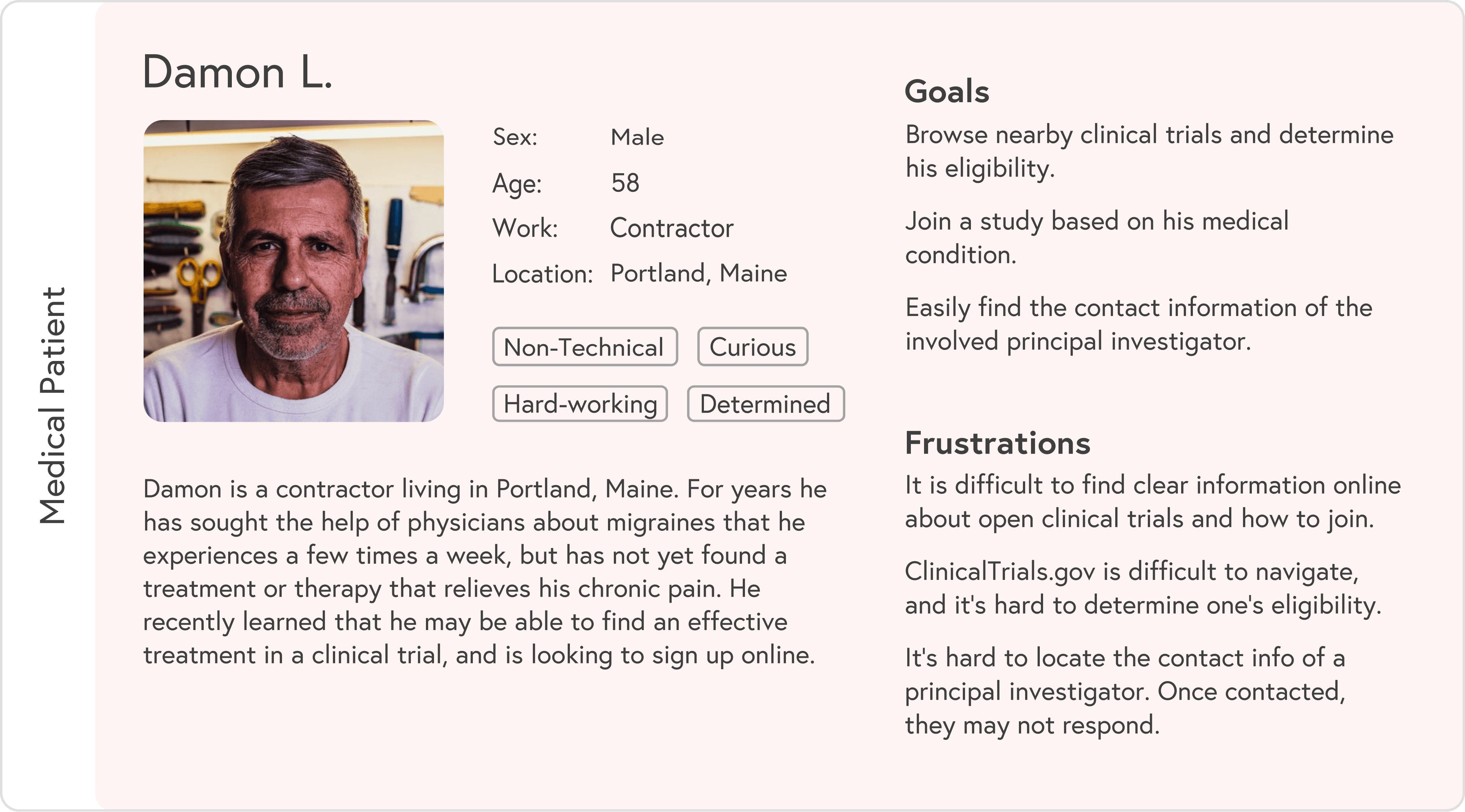
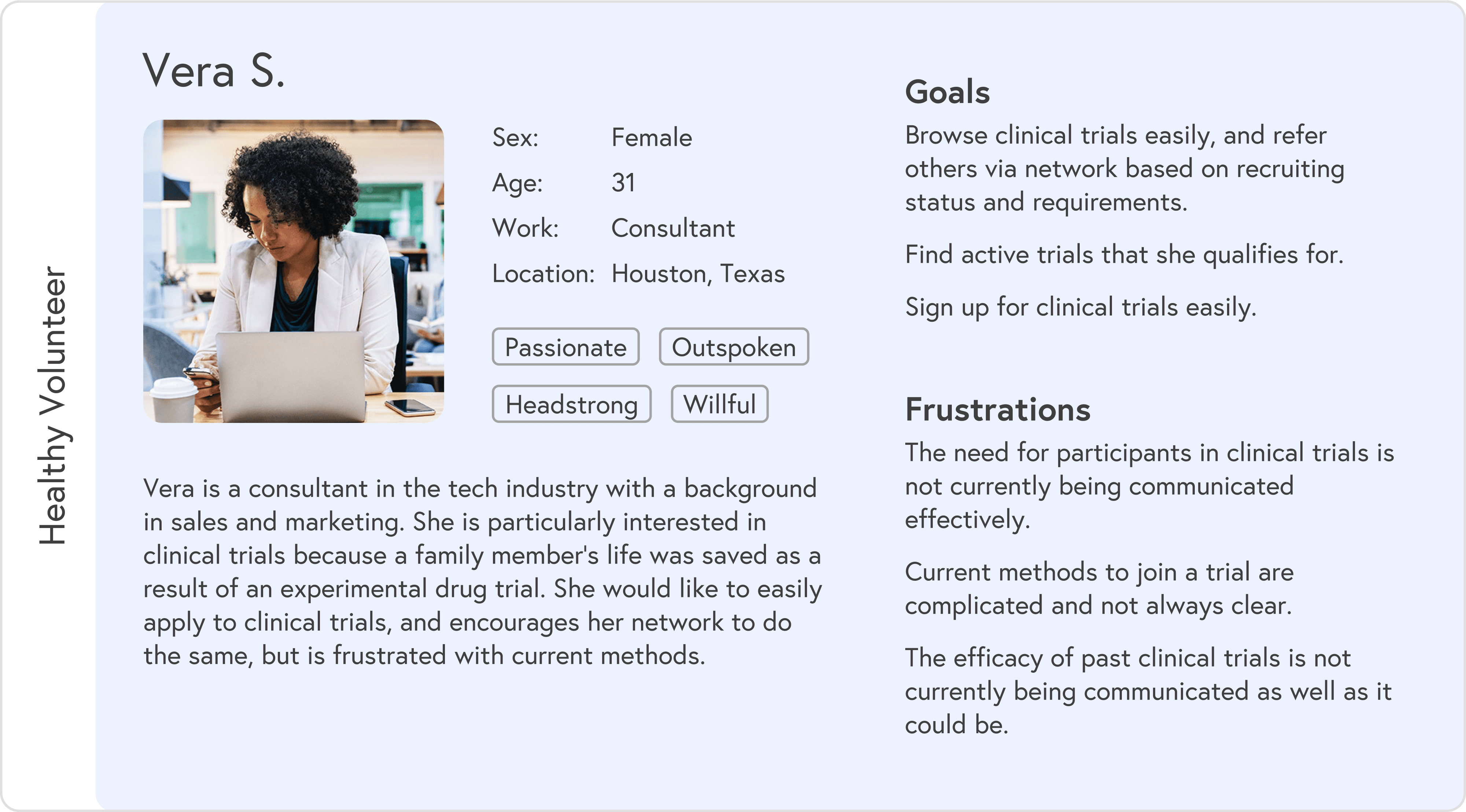
Based on research, I created two primary personas:
Medical patient: often overwhelmed, short on time, and dealing with ongoing symptoms while searching for options
Healthy volunteer: curious, flexible, and more open to browsing broadly
Each persona had different entry points and questions, but both needed a simple way to understand “Is this for me, and how do I start?”
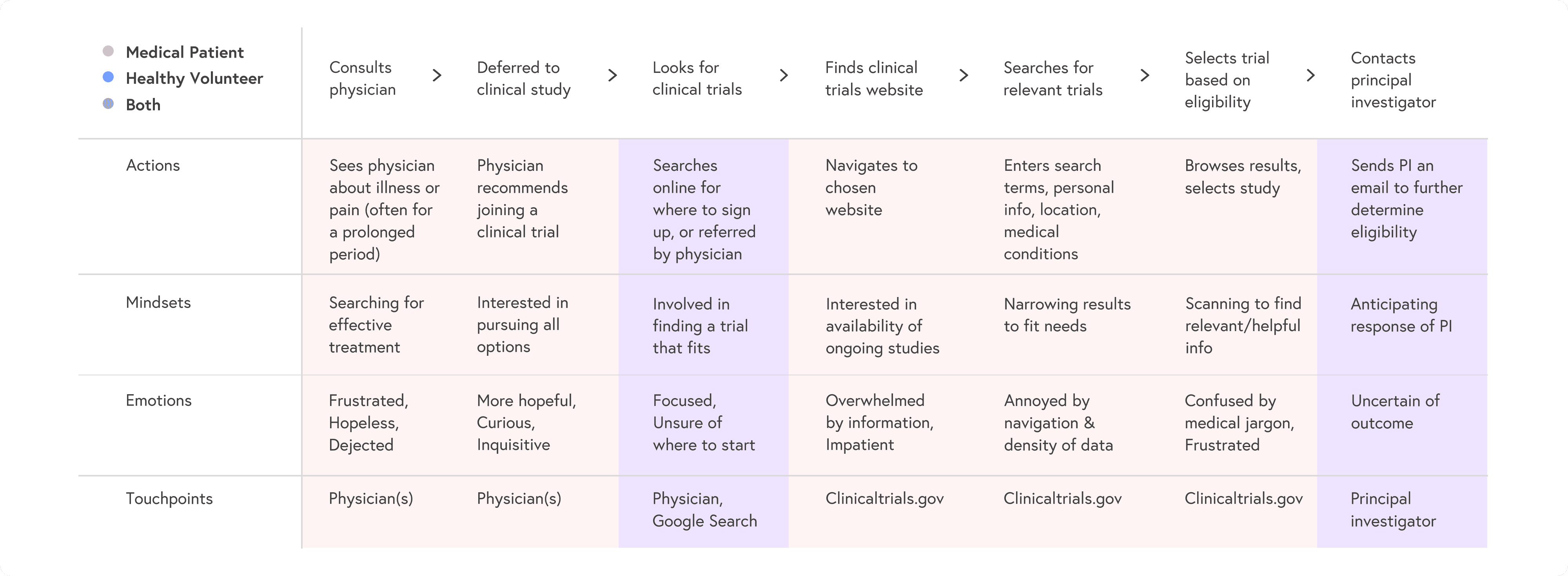
User journeys
I mapped patient and volunteer journeys from awareness to enrollment, highlighting:
where people abandoned ClinicalTrials.gov
where they needed reassurance or clearer language
key decision points like “Is this nearby?” and “Can I realistically commit to this schedule?”
These maps guided which steps to keep, remove, or redesign in the new flow:
Design
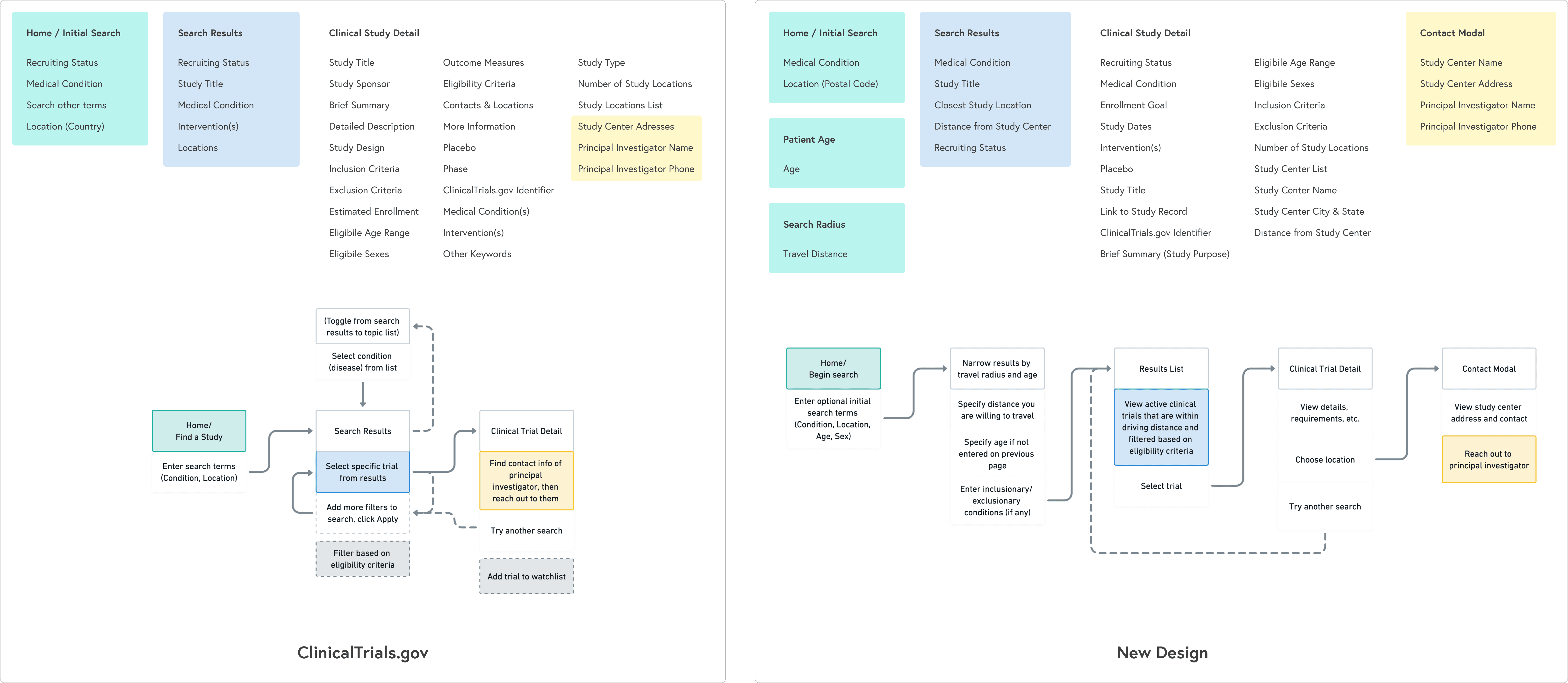
Information architecture and flows
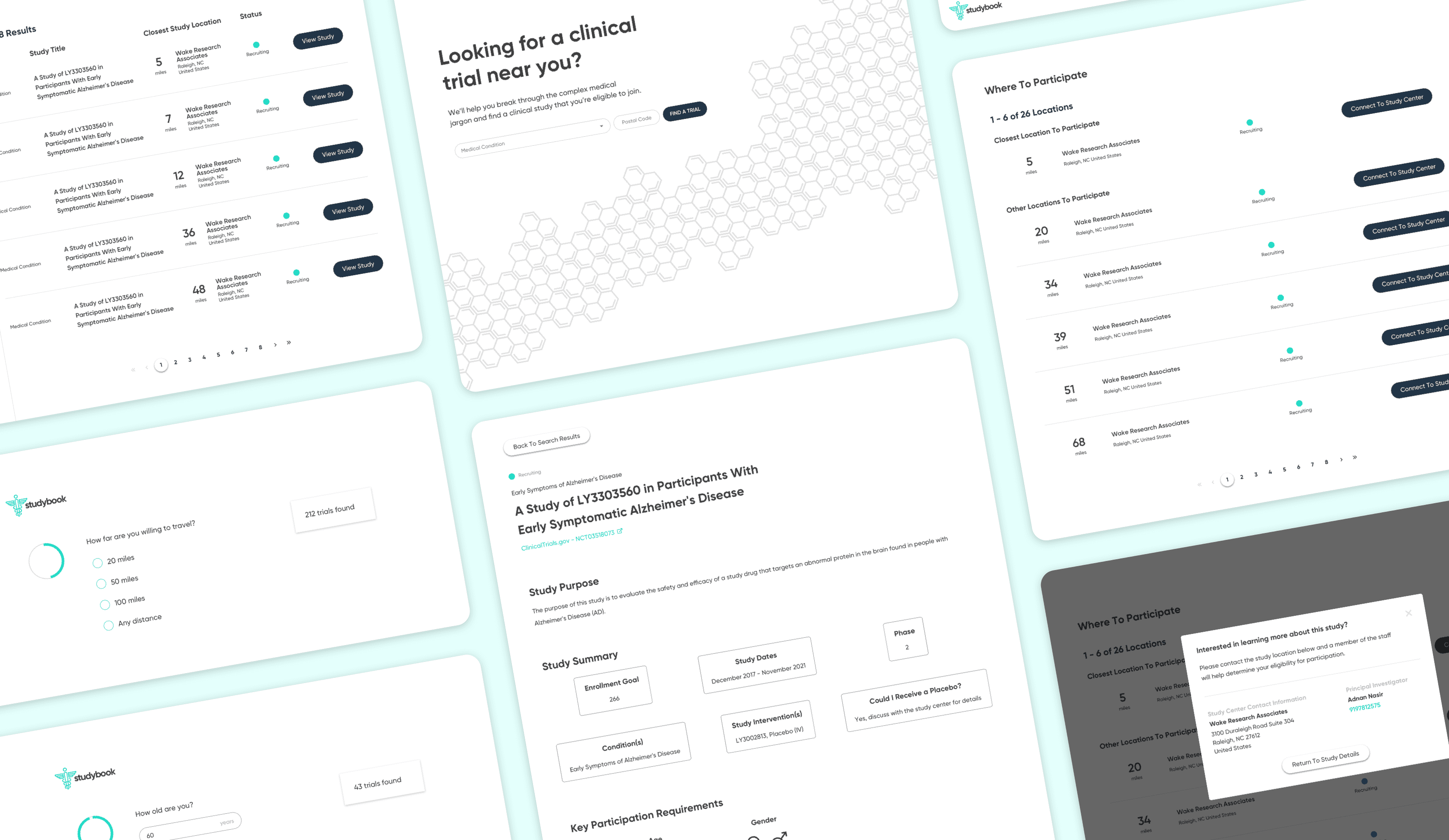
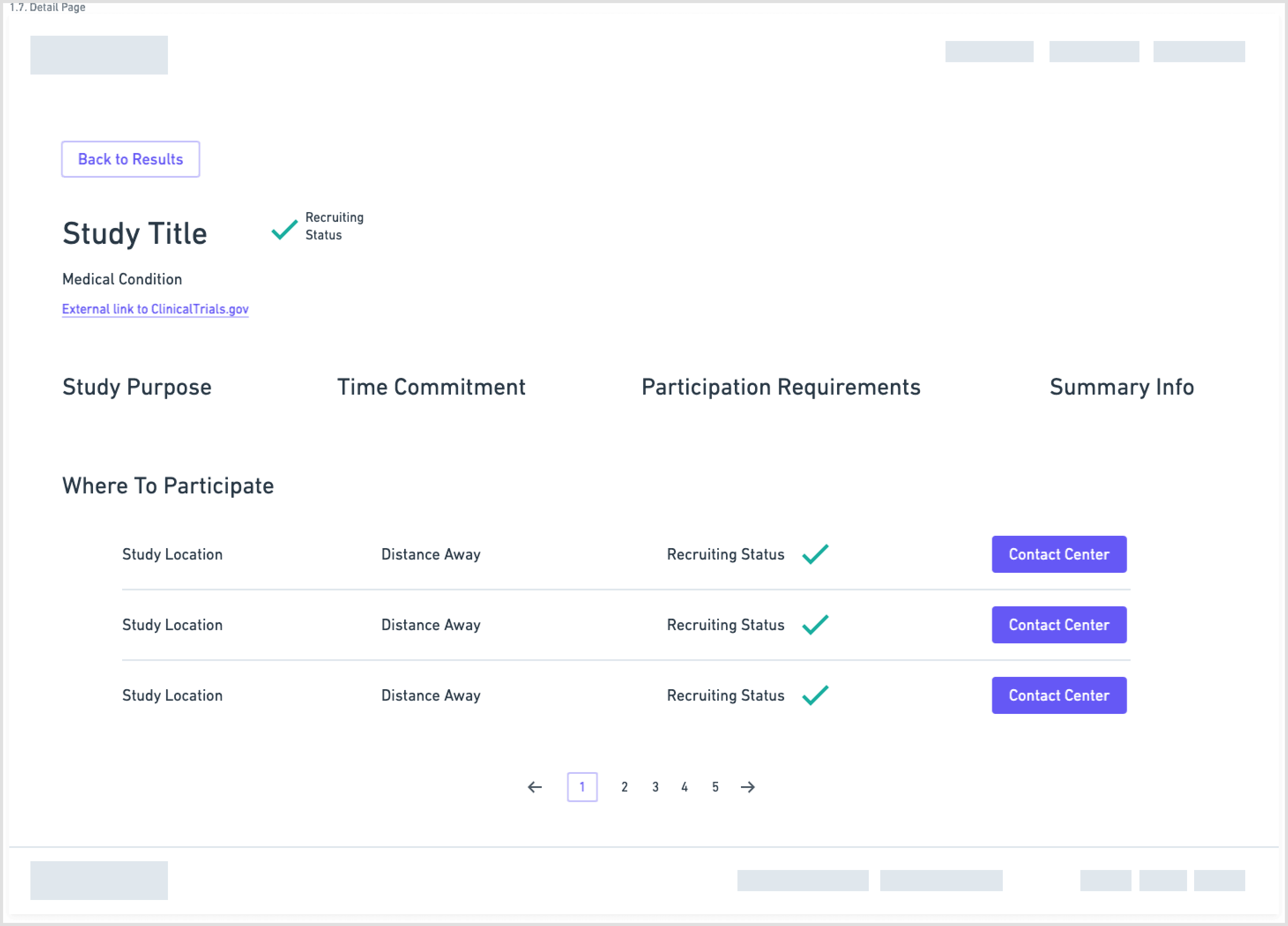
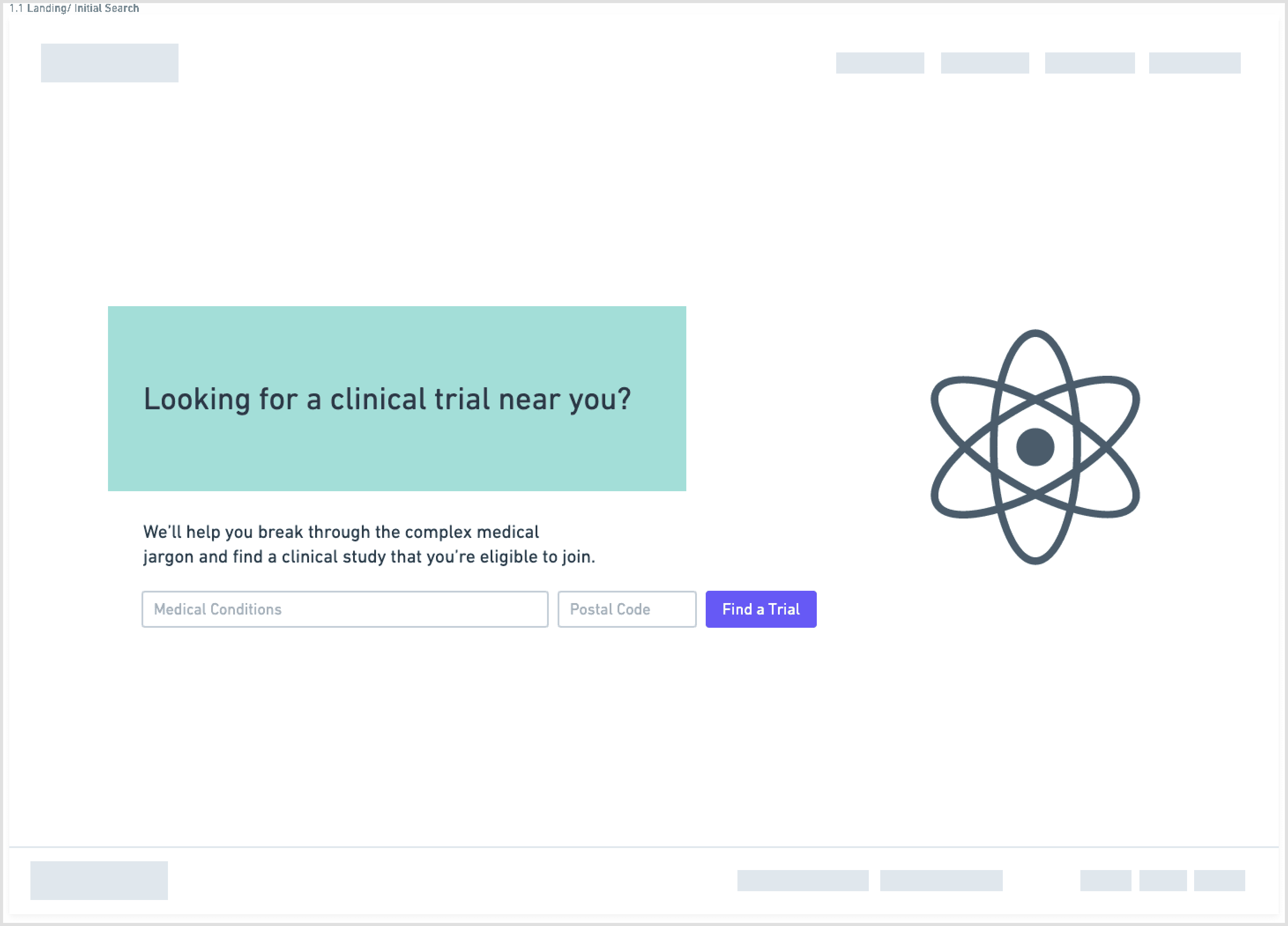
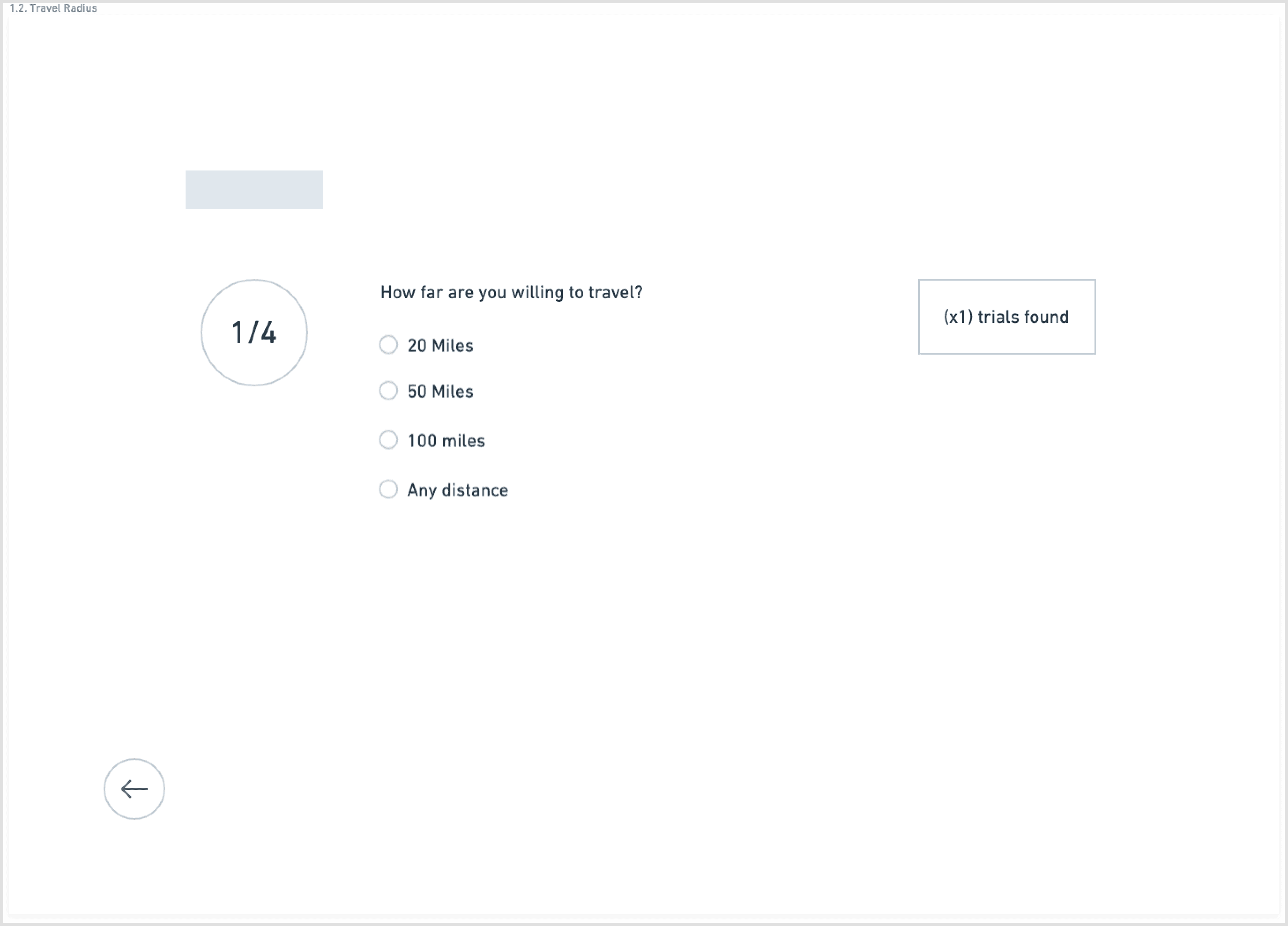
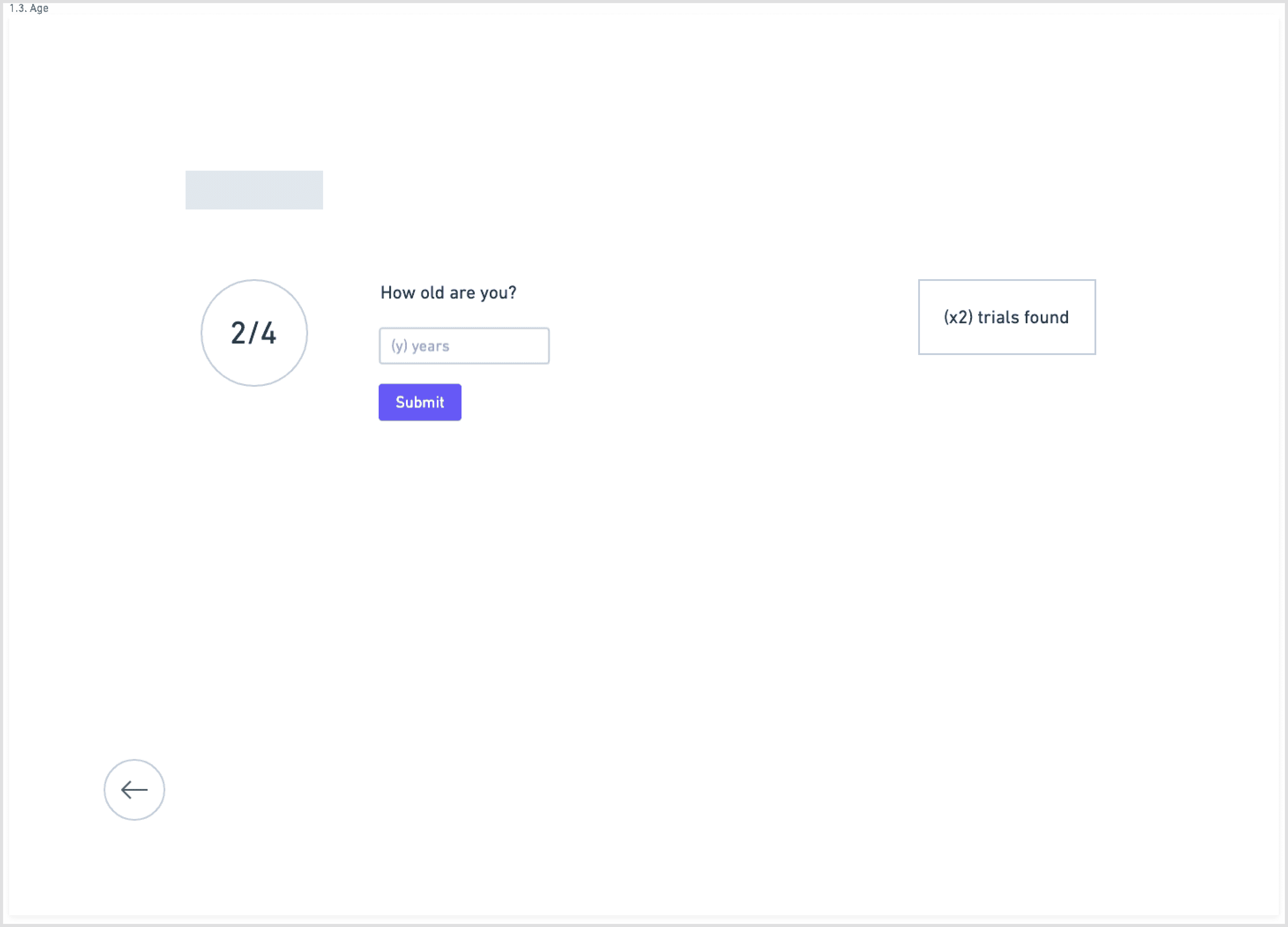
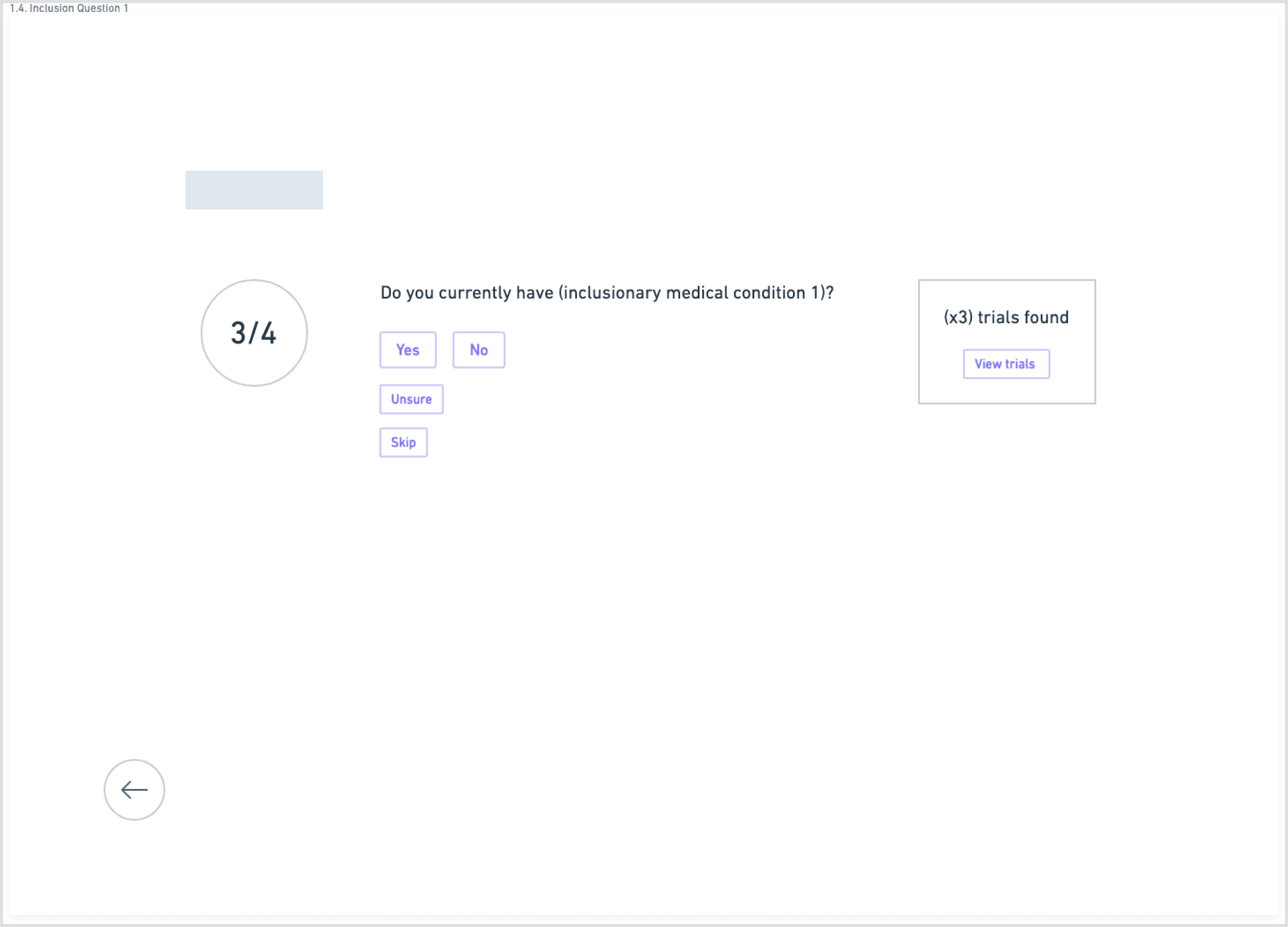
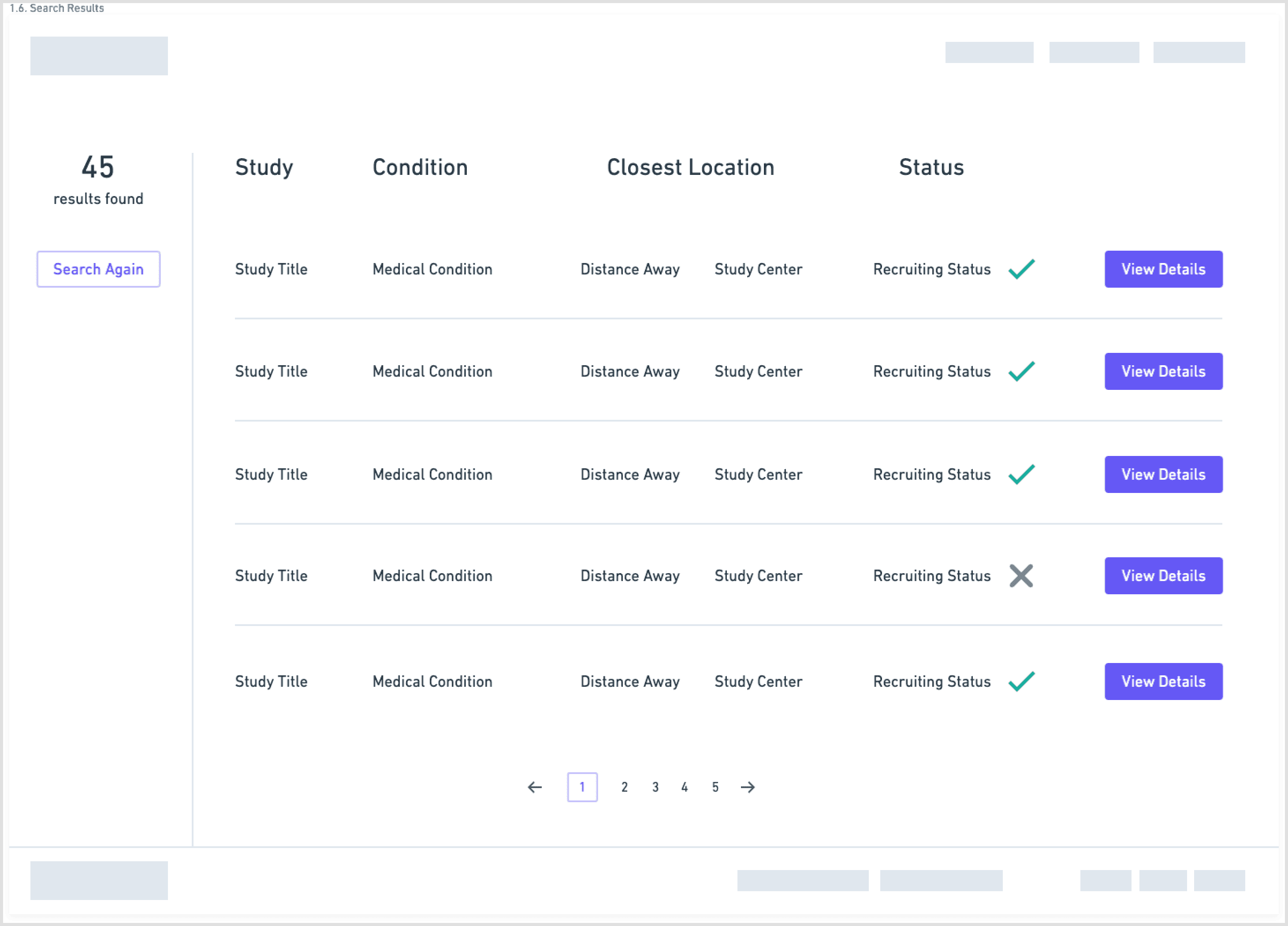
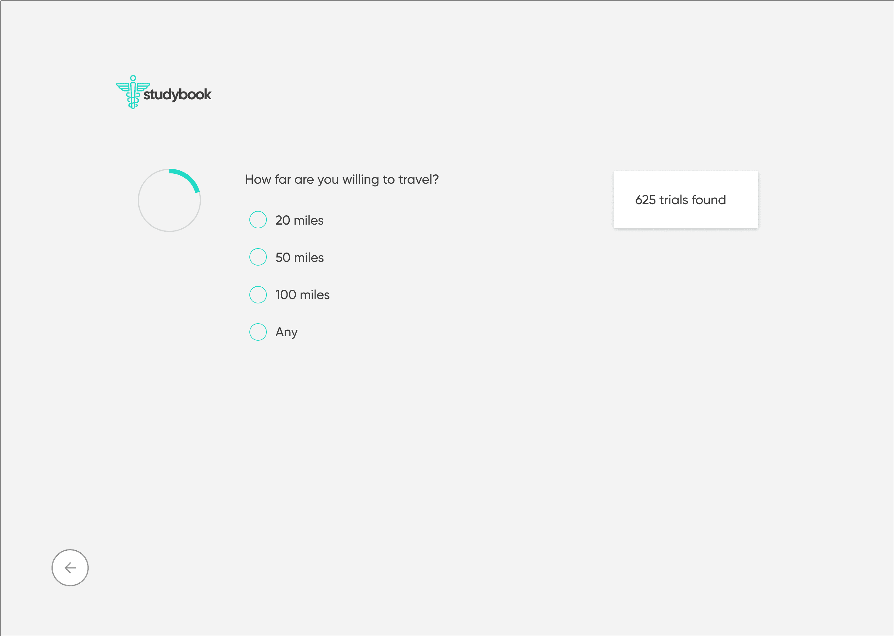
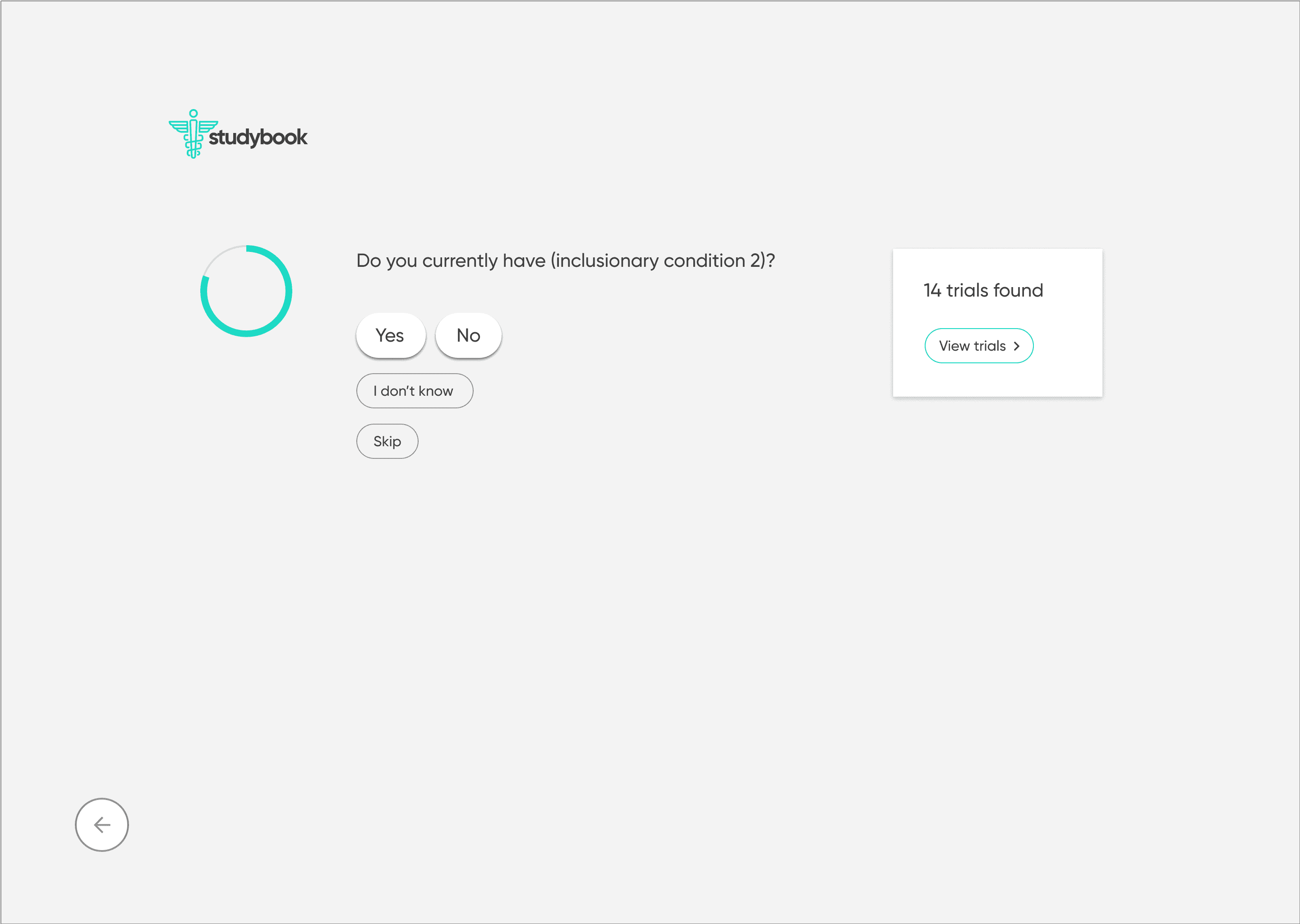
To counter the “wall of text” problem, I based the redesign on progressive disclosure: show only the essential information first, then reveal more detail as needed.
The main flow:
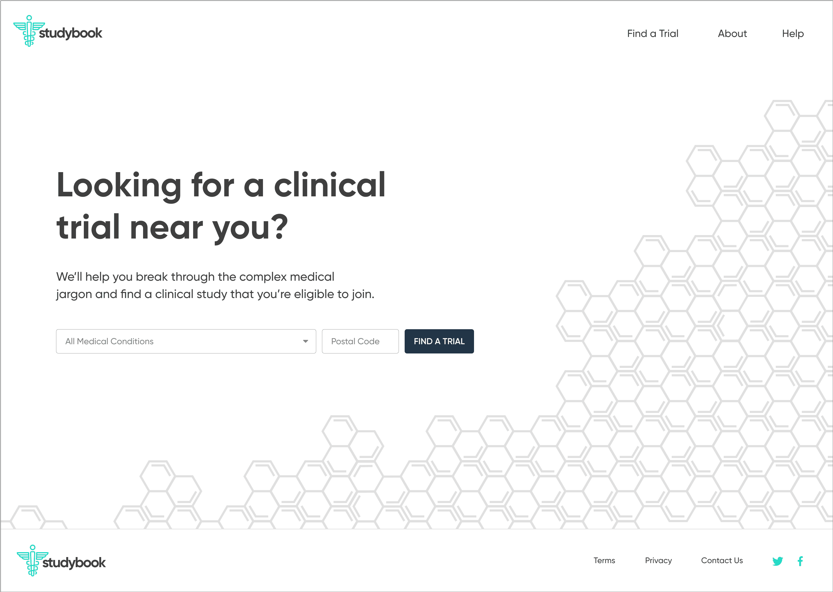
Start with a guided search: condition, location, and high-level preferences
Show concise, scannable results summarizing condition, study type, location, and time commitment
On selection, present a focused study overview in plain language
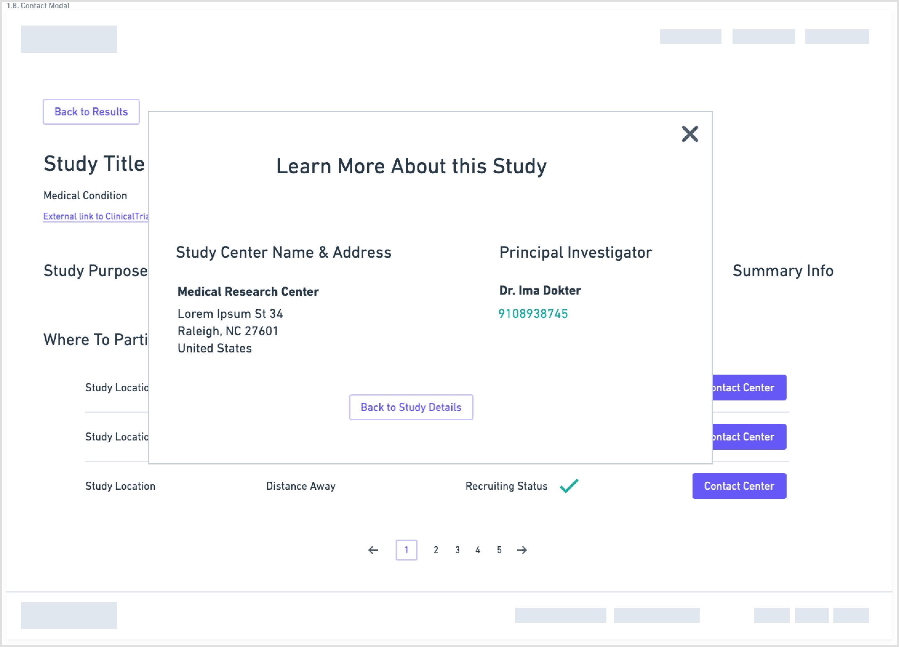
Separate and highlight “How to join” with contact details, next steps, and what to expect
Wireframes
I explored this structure in low-fidelity wireframes, stripping each screen down to the minimum:
one primary action per step
short blocks of copy instead of long paragraphs
clear emphasis on eligibility and logistics
The goal was to lower cognitive load and make it obvious how to move forward. (See page 9 wireframes for the initial flow.)
High-fidelity designs and prototype
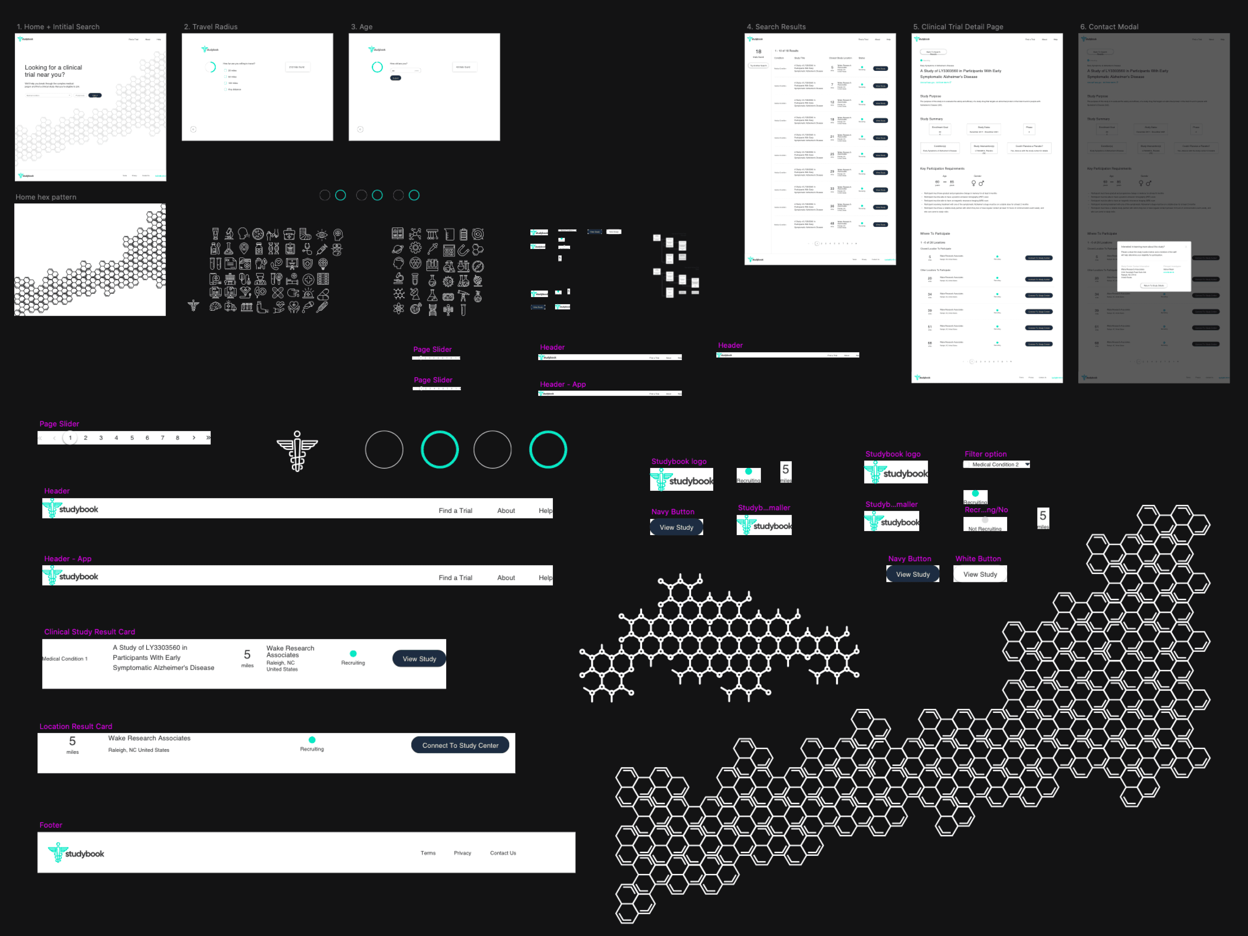
I first designed the interface in Sketch, then migrated it to Figma with a small, reusable component library. The final UI used:
minimal color
clear typographic hierarchy
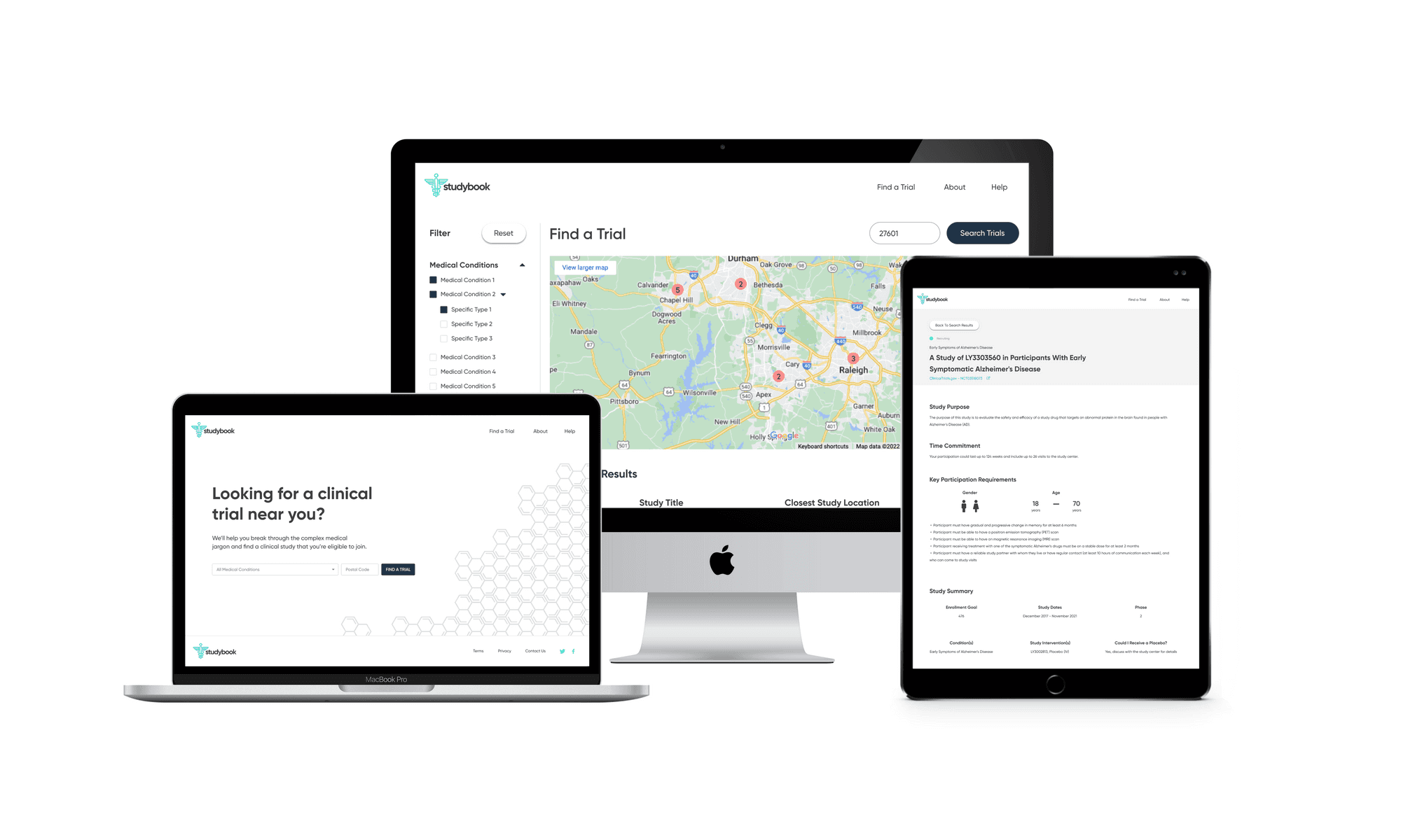
a responsive layout across desktop and mobile
The screens walk users from search → filtered results → study overview → contact information, with a consistent emphasis on “what matters right now” for a patient. I then created a clickable prototype in Figma to test and demonstrate the flow.
Front-end MVP
To bring the concept closer to reality, I partnered with a front-end developer who implemented the core flow as a live site using my Figma designs. The build did not connect directly to the ClinicalTrials.gov API, but it showed how a production experience could look and behave with real data.
Reflection
This project started as a design exercise but became a deeper look at how critical information is presented to people making serious health decisions. A few takeaways:
Even small changes in information hierarchy can meaningfully reduce confusion.
Treating contact details and “how to join” as first-class features, not footnotes, fundamentally changes the experience.
Short, focused research with the right stakeholders (investigators, participants, caregivers) can uncover the real decision drivers quickly.
If I revisited this now, next steps would include usability testing with patients, integrating real ClinicalTrials.gov data, and exploring ways to keep physicians in the loop as patients discover and join trials.
References
(2012, July 18). Clinical trial delays: America's patient recruitment dilemma. Retrieved from https://www.clinicaltrialsarena.com/analysis/featureclinical-trial-patient-recruitment
(2018, September 7). Why do Recruitment Efforts Fail to Enroll Enough Participants? Retrieved from https://forteresearch.com/news/recruitment-efforts-fail-enroll-enough-patients
Institute of Medicine (US) Forum on Drug Discovery, Development, & Translation. (1970, January 1). The State of Clinical Research in the United States: An Overview. Retrieved from https://www.ncbi.nlm.nih.gov/books/NBK50886/
Fogel, D. B. (2018, August 7). Factors associated with clinical trials that fail and opportunities for improving the likelihood of success. Retrieved from https://www.ncbi.nlm.nih.gov/pmc/articles/PMC6092479
(2016, May 5). How to find a perfect match – Empowering patients to find their way through clinical trials. Retrieved from https://www.patientresearchexchange.org/stories/detail/how-to-find-a-perfect-match-empowering-patients

